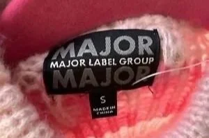
Major Label Group Designs
Overview
During my Summer 2025 internship at Major Label Group, I was responsible for conceptualizing, designing, and preparing holiday-themed sweaters and sweatshirts for the upcoming retail season. These designs were developed for mass-market distribution and presented to major national retailers, including Target and Walmart.
My role spanned the full product development journey: concept ideation, trend alignment, graphic creation, color story development, technical refinement, and final presentation for retail buyers. The collection ultimately moved forward to market, positioning Major Label Group for a competitive and successful holiday launch.
Role: Graphic Designer | Timespan: 10 weeks | Platforms Used: Adobe Illustrator, Photoshop
THE Problem
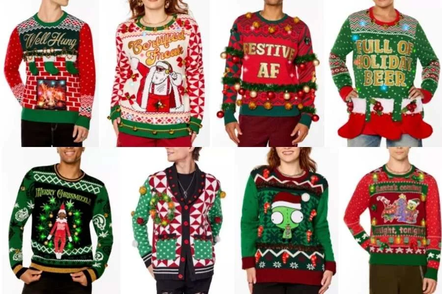
Holiday apparel is one of the most saturated and competitive seasonal categories in retail. Consumers expect novelty, humor, and visual impact — but retailers require commercial viability, production feasibility, and price-point discipline.
· The challenge was to design products that were:
· Eye-catching and trend-relevant
· Retail-ready at accessible price points
· Visually differentiated from competitors
· Appropriate for large-scale production
· Appealing across diverse demographics
Holiday sweaters must feel fresh — but still familiar enough to convert quickly at retail.
Problem Statement
How might we design a commercially viable holiday sweater and sweatshirt collection that balances humor, nostalgia, and seasonal tradition while meeting mass-market retail requirements for cost, manufacturability, and broad consumer appeal?
THE CHALLENGE
The key design challenge was balancing novelty with scalability.
Retailers such as Target and Walmart prefer designs that have:
· Strong visual legibility from a distance
· Clear, legible concepts and ideas
· Potential for gifting and marketability
· Production timing
· Cost-effective graphic application (primarily acrylic knits and screen print)
I needed to make sure each design could:
· Stand out from the crowd
· Appeal to multiple age groups
· Translate cleanly into repeatable production
· Align with retailer-specific consumer profiles
THE PROCESS
USER RESEARCH
To better immerse myself in the trends and state of the fashion industry, I conducted both observational and marketing research.


Consumer Insights
Consumers during the holiday season typically fall into three groups:
· Event-driven buyers (office parties, themed gatherings)
· Gifting purchasers
· Seasonal enthusiasts
Consumers respond strongly to:
· Recognizable icons (Santa, reindeer, trees)
· Sports crossovers/iconography
· High-contrast color blocking
· Clear humor or wordplay
This research directly influenced the direction of my designs.
Retail Scan
I looked up and analyzed the in-store and online catalogs from:
· Target
· Walmart
· Kohl’s
· Old Navy
· Spencer’s
· And many others
During my research, I found these recurring themes:
· Sports-meets-holiday mashups
· Clever and humorous wordplay
· Santa reinterpretations/spins on classic icons
· Ornament-patterned prints
· Clear and bold red and green palettes
· Light-up and interactive elements
Competitive Analysis & Inspiration
Competitive analysis revealed that many sweaters relied on:
· Overly dense visual clutter
· Repetitive icon patterns
· Generic Santa graphics-no flair or “twists”
· Minimal storytelling
To differentiate, I focused on:
· Narrative-driven central illustrations
· Character-based and word-based humor
· Sports reinterpretations (Hockey Santa, Baseball Santa)
· Dimensional layering in graphic composition
· Controlled visual hierarchy
Rather than repeating standard Christmas iconography, I designed narrative scenes with personality.
VISUAL DESIGN STRATEGY
My visual strategy was structured around four pillars:
1. Bold Central Focus
Each design features a dominant focal point:
· Santa skating forward (Hockey)
· Santa mid-swing (Baseball)
· Illuminated tree with glowing effects (I’M LIT)
· Expressive reindeer portrait (OH DEER!)
3. Pattern vs. Narrative Balance
Some designs leaned toward:
· Narrative scenes (Hockey, Baseball, OH DEER!)
Others embraced:
· Repeating pattern systems (ornament sweater)
This created a variety of assortments within the shirt’s boundaries.
2. Strategic Color Blocking
I maintained strong red and green foundations while incorporating:
· Neutral grounding tones
· Black backgrounds for contrast (ornament pattern sweater)
· Controlled accent colors for depth
4. Retail Scalability
Design files were created with:
· Clean vector-based construction
· Defined color separations
· Production-aware detailing
· Acrylic-friendly execution
All graphics were built for clean reproduction at scale.
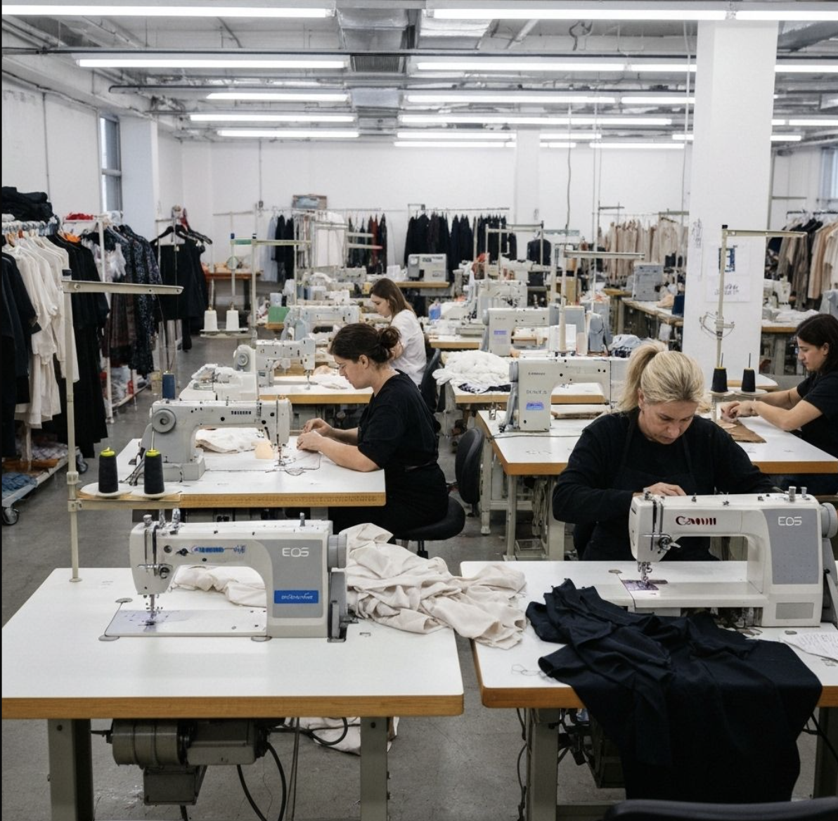
Prototyping & Iteration
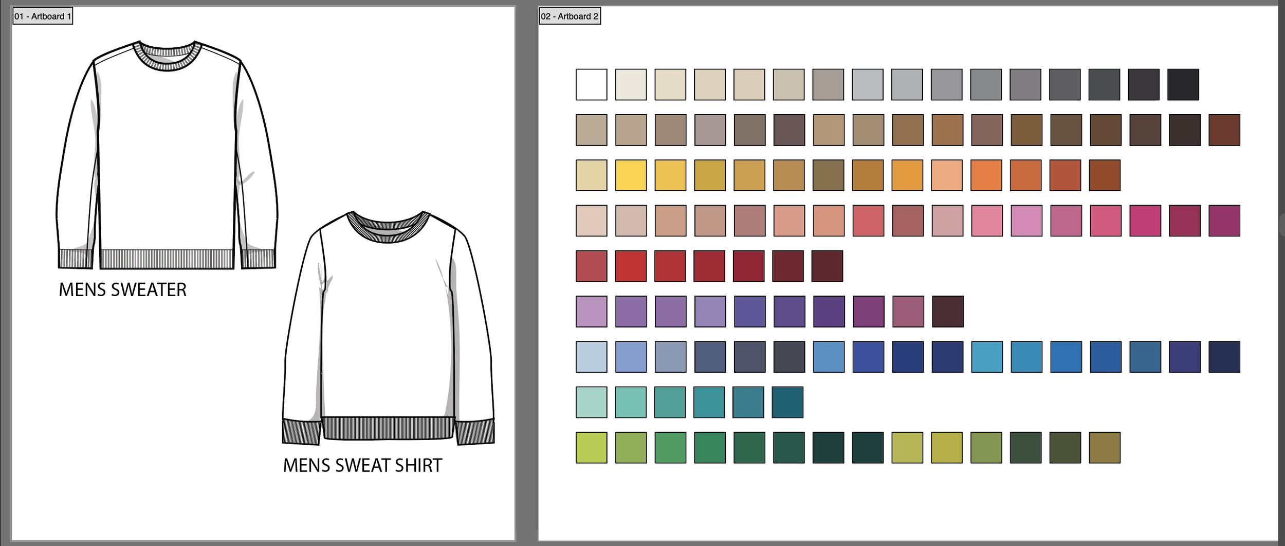
I started with a blank base sweatshirt or sweater file provided by Major Label Group’s staff. After taking it into Illustrator and processing my idea, I first drew the main subject of the shirt in a grayscale format. When the drawing is done, I transform it into a Pathfinder object, and it allows me to easily edit the coloring of the drawing.
After the main subject is properly aligned on the shirt, I take the time to think about what could be in the background or outside details I should include within its design. I then proceed to do the same step as above, but on a smaller scale to add any additional objects to the shirt’s background. Fonts are properly researched as well, and clever wordplay comes up on my own. Additionally, for sweaters, I also came up with a pattern to wrap around the wearer’s arms and back.
FINAL DESIGNS
Here is the final collection of designs I created for Major Label Group:
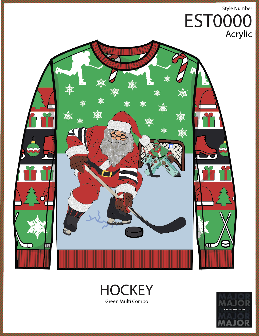
Hockey
Green Multi Combo– Santa in action on ice, layered with snowflakes and side-panel sports iconography.
Key Design Features:
This piece became a strong example of narrative layering. The skating Santa creates forward movement, while the goalie adds contextual storytelling. Sleeve graphics reinforce the sports theme without overwhelming the main composition.
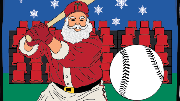
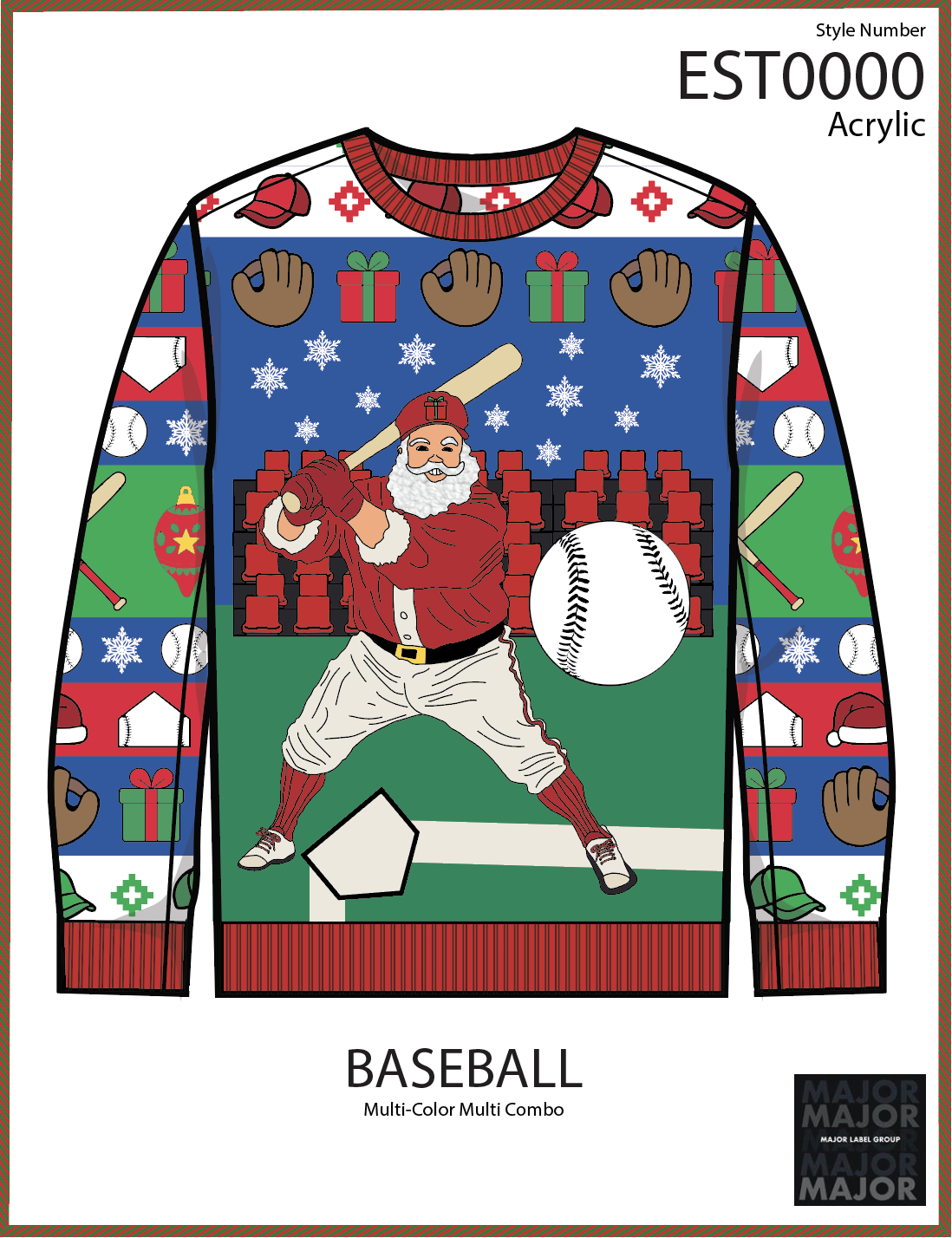
Baseball
Multi-Color Combo– Stadium-inspired Santa batting scene with structured pattern sleeves.
Key Design Features:
This design merges Americana and holiday nostalgia. The stadium seating backdrop provides environmental depth, making it feel immersive rather than flat.
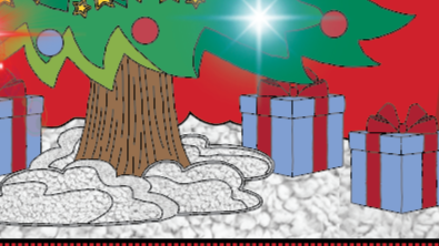
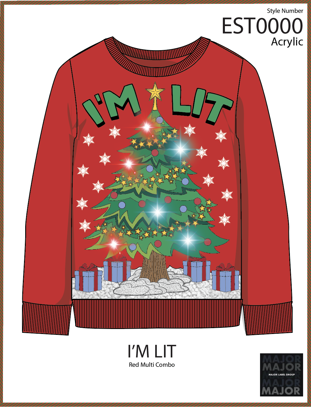
I’m Lit
Red Multi Combo – Typographic-led tree design with star and glow elements.
Key Design Features:
A typography-driven piece designed for maximum retail visibility. The phrase acts as the hook, supported by glowing ornament effects and layered star embellishments.
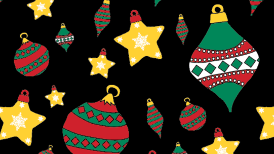
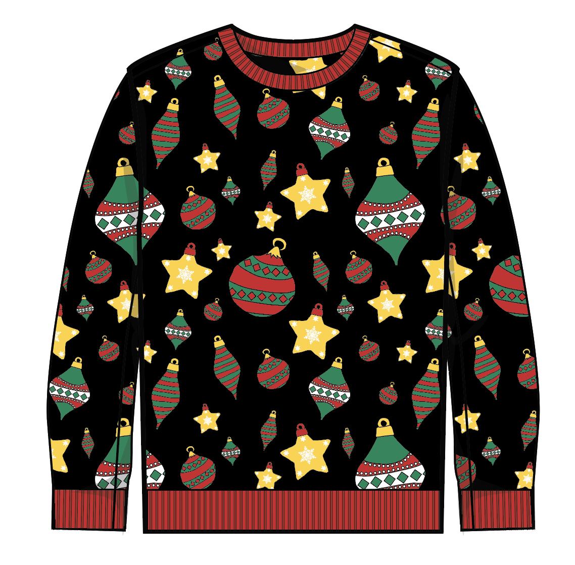
Ornaments
Black Multi Combo – High-density repeat pattern balancing color and contrast.
Key Design Features:
Exemplifies my capability to create patterns and repeated designs for a classic sweater suitable for all demographics to wear. The variation of the ornaments and patterns is rich, wth the diamonds and star-shaped ornaments spaced out well and in an organized manner.
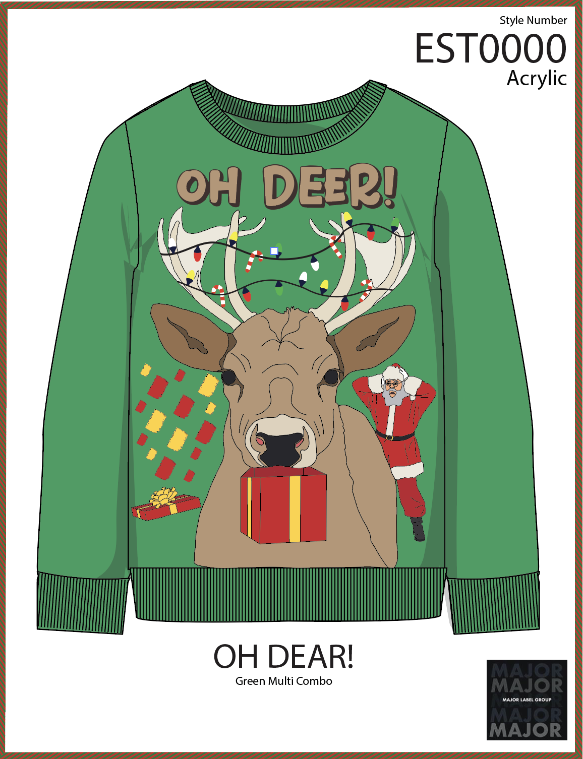
OH Deer!
Green Multi Combo – Humorous reindeer portrait with expressive storytelling detail.
Key Design Features:
A pun-driven concept built around exaggerated character expression. The lighting-wrapped antlers introduce visual humor while maintaining a cohesive seasonal palette.
Impact & Reflection
Project Outcomes
During retailer presentations, these designs were positioned as part of Major Label Group’s holiday assortment strategy. The ability to present directly to buyers from major chains was an invaluable professional experience.
The collection:
· Demonstrated trend awareness
· Reflected market differentiation
· Balanced humor and tradition
· Met retailer production requirements
Seeing my designs move toward market validation both boosted my natural creative instincts and my strategic thinking. Some of them made it onto store shelves later that year.
Learning & Growth
This internship significantly expanded my understanding of:
· Designing within commercial constraints
· Aligning creativity with retail strategy
· Production-aware graphic design
· Buyer presentation structure
· Trend following and forecasting for seasonal categories
I learned that successful clothing design is not just about visual appeal — it’s about managing a consumer-buyer relationship and solving a retail problem.
Future Development
If expanding this line, I would explore:
· Limited interactive elements (light-up embroidery, texture contrasts)
· Gender-neutral silhouettes
· Licensed collaborations
· Expanded sports crossover categories
· Elevated knit techniques for premium retailers
· Expand into other holidays and occasions besides Christmas
Additionally, integrating sustainable yarn options could strengthen long-term brand positioning.
Retrospective
This internship marked a crucial transition in my development as a designer. It challenged me to think beyond aesthetics and embrace strategic, market-driven creativity.
Designing for national retailers required balancing storytelling, humor, manufacturability, and scalability — all within tight timelines.
The experience solidified my interest in product-driven graphic design and my passion for using design to tell stories, even in unexpected places. It strengthened my confidence in presenting creative work to high-level stakeholders and deepened my understanding of how design decisions directly impact commercial success.