Studies In Design
Overview
This page documents my exploration of graphic design through a series of projects completed during my coursework and personal creative practice. The goal of these projects was to develop a deeper understanding of visual communication, layout systems, typography, and stylistic experimentation. Across several assignments and independent exercises, I designed a range of visual artifacts, including a gaming magazine cover, an event calendar poster, an infographic about gaming benefits, a film-style poster, and even a comic book cover. Each project explored different aspects of design, such as hierarchy, visual storytelling, readability, thematic cohesion, and audience engagement.
These works collectively demonstrate my growing ability to combine illustration, typography, and layout strategies into cohesive visual systems that communicate a clear message and appeal to specific audiences.
Role: N/A | Timespan: College Years | Platforms Used: Adobe Illustrator, Photoshop
THE Problem
Design students are often challenged with balancing creativity and communication. While visual experimentation can be engaging, designs must also maintain readability, hierarchy, and purpose. Throughout my studies, I noticed that early design concepts often leaned heavily toward aesthetics without always fully considering how viewers process information. Typography choices, spacing, and layout structure can dramatically influence how effectively a message is communicated.
Therefore, these projects focused on addressing a core question: How can typography, layout, and visual storytelling be combined to create engaging designs that are both expressive and functional?
Problem Statement
Designers must create visually compelling layouts that communicate information clearly while maintaining aesthetic cohesion. The challenge is to use typography, color, imagery, and hierarchy effectively so viewers can quickly understand the content and message.
This case study explores how intentional design decisions—including font selection, layout structure, and visual hierarchy—can improve both engagement and readability across different media formats.


THE CHALLENGE
Each design presented unique challenges:
· Magazine Cover: Creating a visually dynamic composition while maintaining magazine-style hierarchy and readability.
· Event Calendar Poster: Organizing dense information in a structured and readable layout.
· Infographic: Communicating data visually in an engaging and accessible way.
· Film Poster: Designing dramatic visual storytelling through typography and composition.
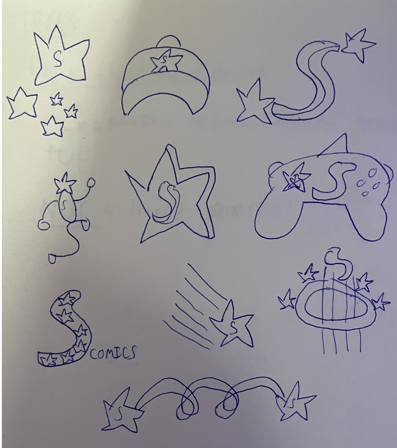
· Comic Cover: Capturing the energy and personality of a fictional hero through illustration and bold graphic design.
Balancing visual excitement with clarity and structure was the central challenge throughout these projects.
THE PROCESS
USER RESEARCH
While these projects were primarily exploratory exercises, I considered audience expectations for each design format.
For example:
· Gaming Magazine Readers: Expect bold visuals, energetic typography, and strong imagery.
· Event Poster Viewers: Need clear organization and easy-to-scan information.
· Infographic Readers: Prefer quick, visually digestible insights.
· Movie Poster Audiences: Expect dramatic visuals that convey tone and genre.
· Comic Readers: Look for stylized artwork and strong character presence.
By identifying these user expectations, I tailored each design to its intended audience.

Inspiration
My inspiration came from a variety of sources across gaming culture, entertainment media, and modern graphic design.
Influences included:
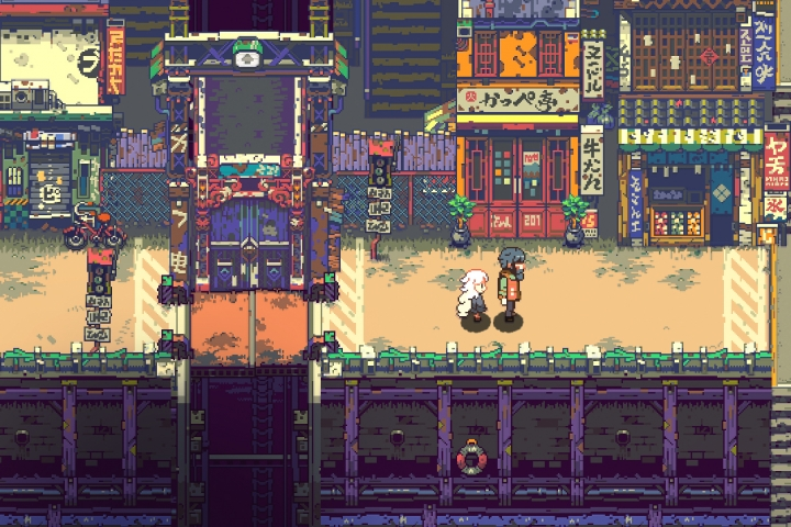
· Retro video game aesthetics and pixel-based graphics
· Comic book cover compositions and dramatic poses
· Film poster typography and cinematic layouts
· Infographic design trends emphasizing icons and simplified visuals
· Editorial magazine layouts with strong and effective typographic hierarchy
These references guided both the visual style and the structural approach of the designs.
VISUAL DESIGN STRATEGY
Each project followed several key design principles:
Color
Color palettes were chosen to reflect the theme of each design:
· Warm reds and oranges for energetic gaming visuals
· Cool blues for technology-related infographics
· Dramatic contrasts for cinematic posters
Typography
Typography played a central role in shaping the identity of each design. I experimented with:
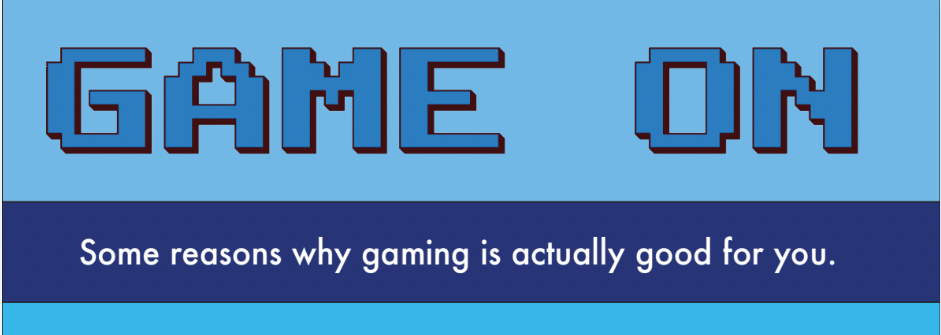
· Pixel-inspired fonts for gaming aesthetics
· Bold display type for headlines
· Clean sans-serif fonts for informational text
· Decorative lettering for entertainment-themed pieces
Layout and Hierarchy
To ensure readability, I implemented clear visual hierarchy through:
· Size contrast
· Strategic spacing
· Section grouping
· Alignment and grid structures
Prototyping & Iteration
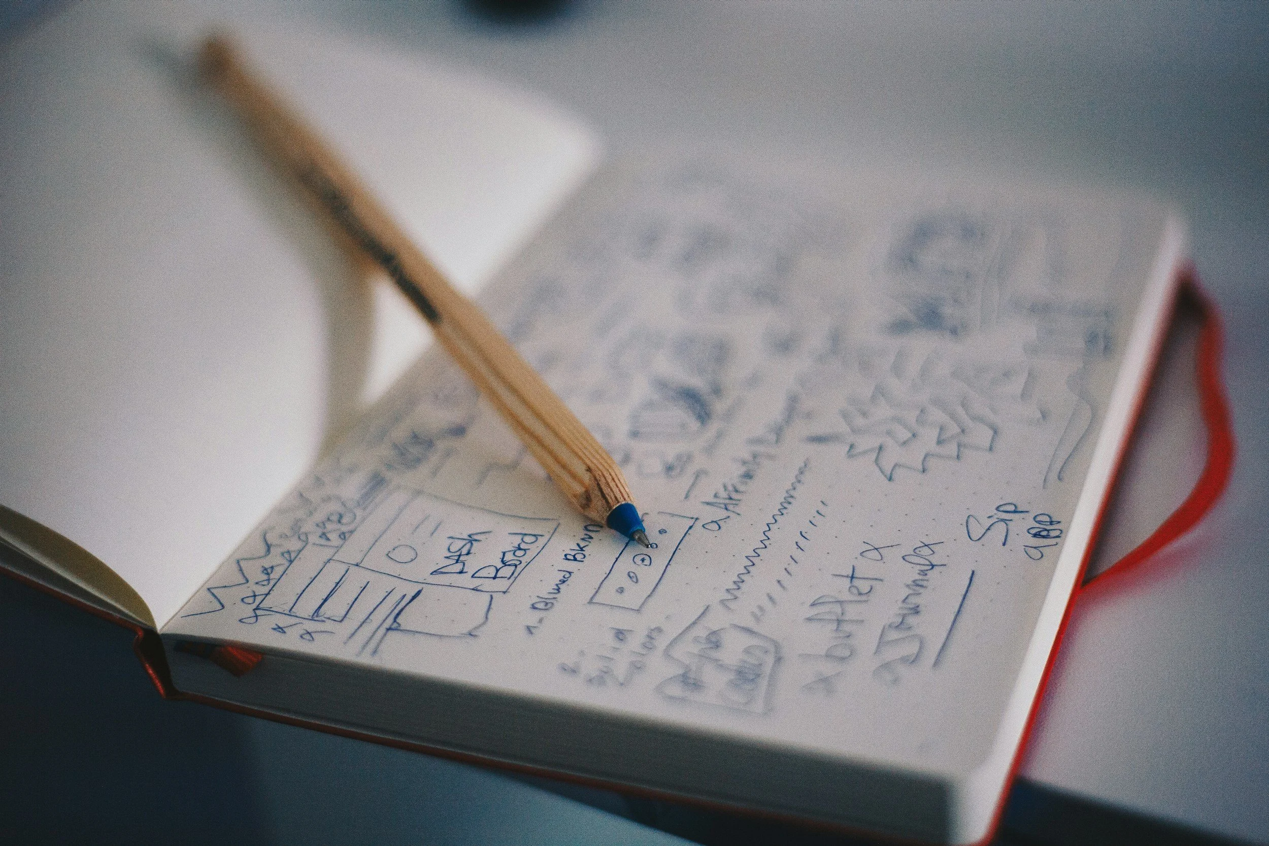
The design process involved multiple stages of sketching, layout experimentation, and refinement.
Initial iterations focused on exploring:
· Type placement
· Image balance
· Information grouping
· Visual focal points
As designs evolved, I refined spacing, alignment, and typography to improve clarity and cohesion. Feedback from classmates and instructors helped identify areas for improving hierarchy and readability.
Through iteration, each design became more polished and communicative.
FINAL DESIGNS
The final collection includes five key pieces that represent different design approaches.
Gaming Magazine cover
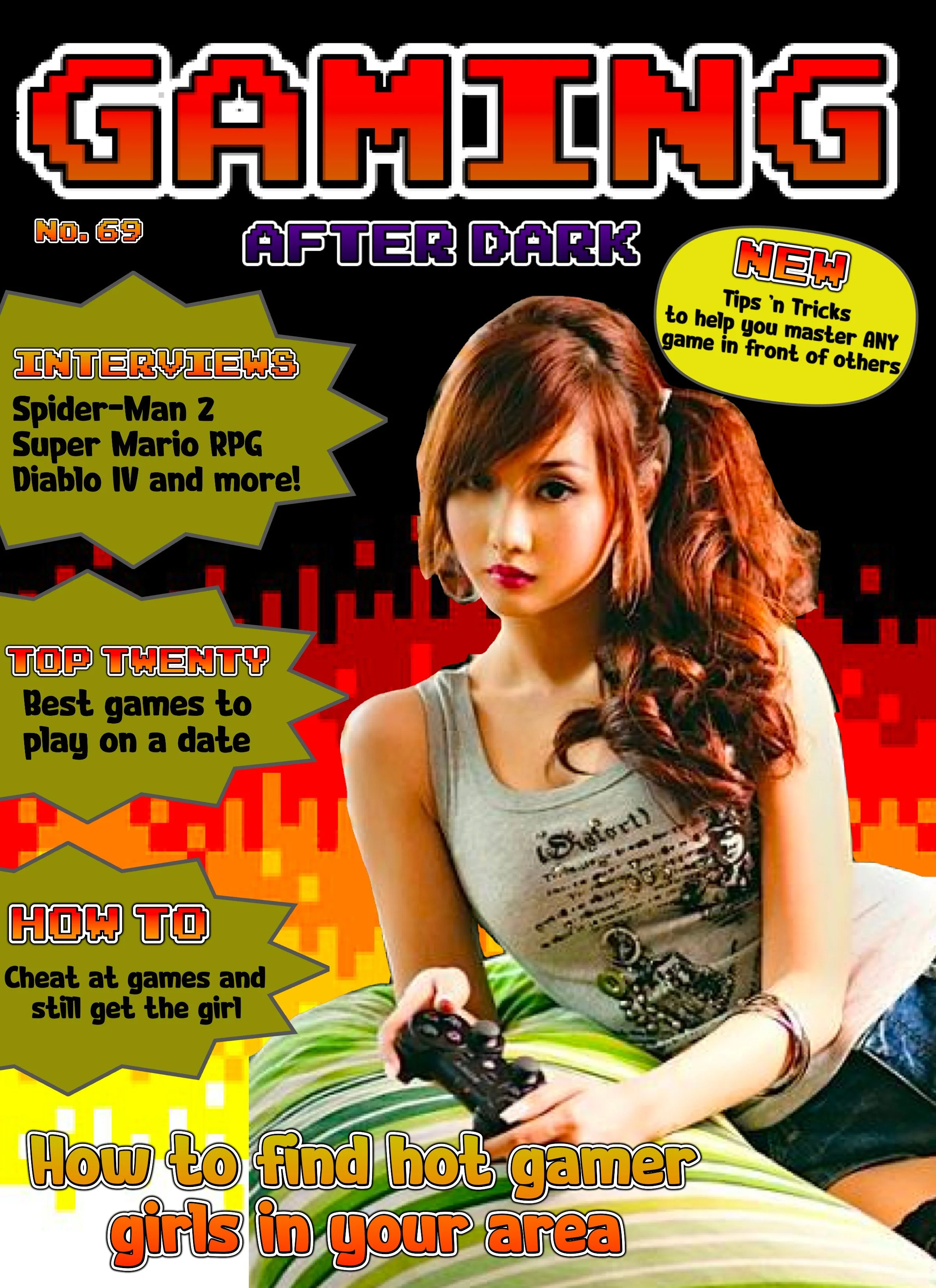
Gaming After Dark
This design emphasizes bold typography, vibrant color gradients, and strong visual focus. The cover mimics the style of gaming publications, with feature callouts, headlines, and promotional text placed strategically to guide the reader’s eye.
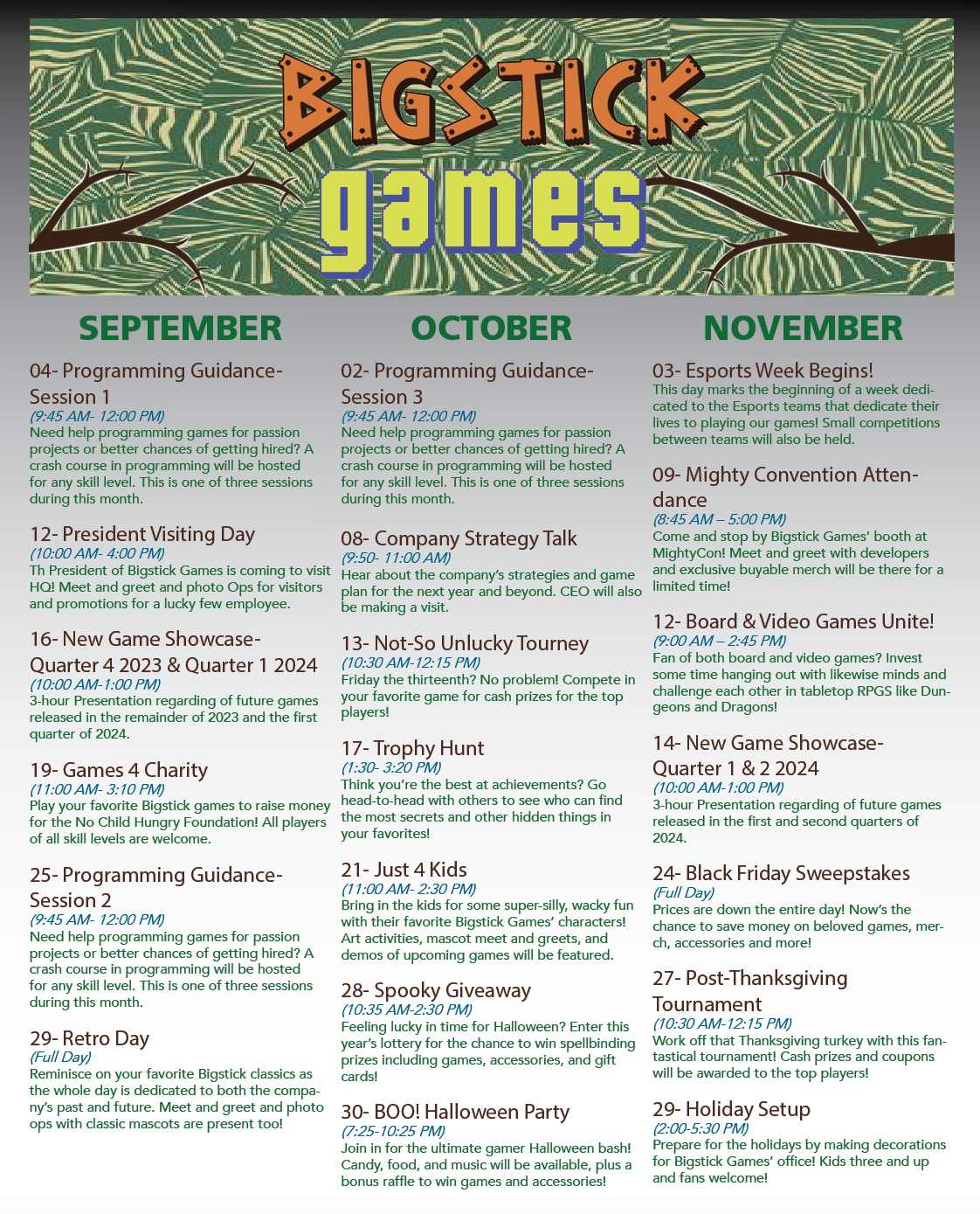
Event Calendar Poster
“BigStick Games” Event Calendar
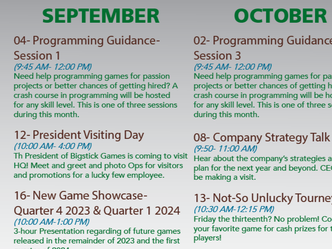
This poster demonstrates structured layout design. Information is organized into clear monthly sections with headings, dates, and descriptions arranged in a readable format. The design balances dense information with visual breathing room.
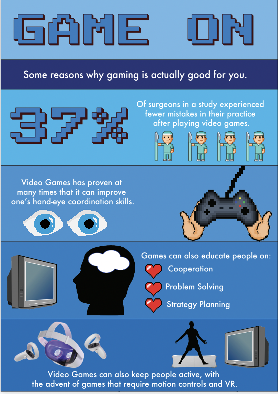
Gaming Infographic
“Game On” Infographic
The infographic communicates the benefits of video games through icons, statistics, and simplified text. A vertical layout guides the viewer through the information sequentially while maintaining visual engagement.
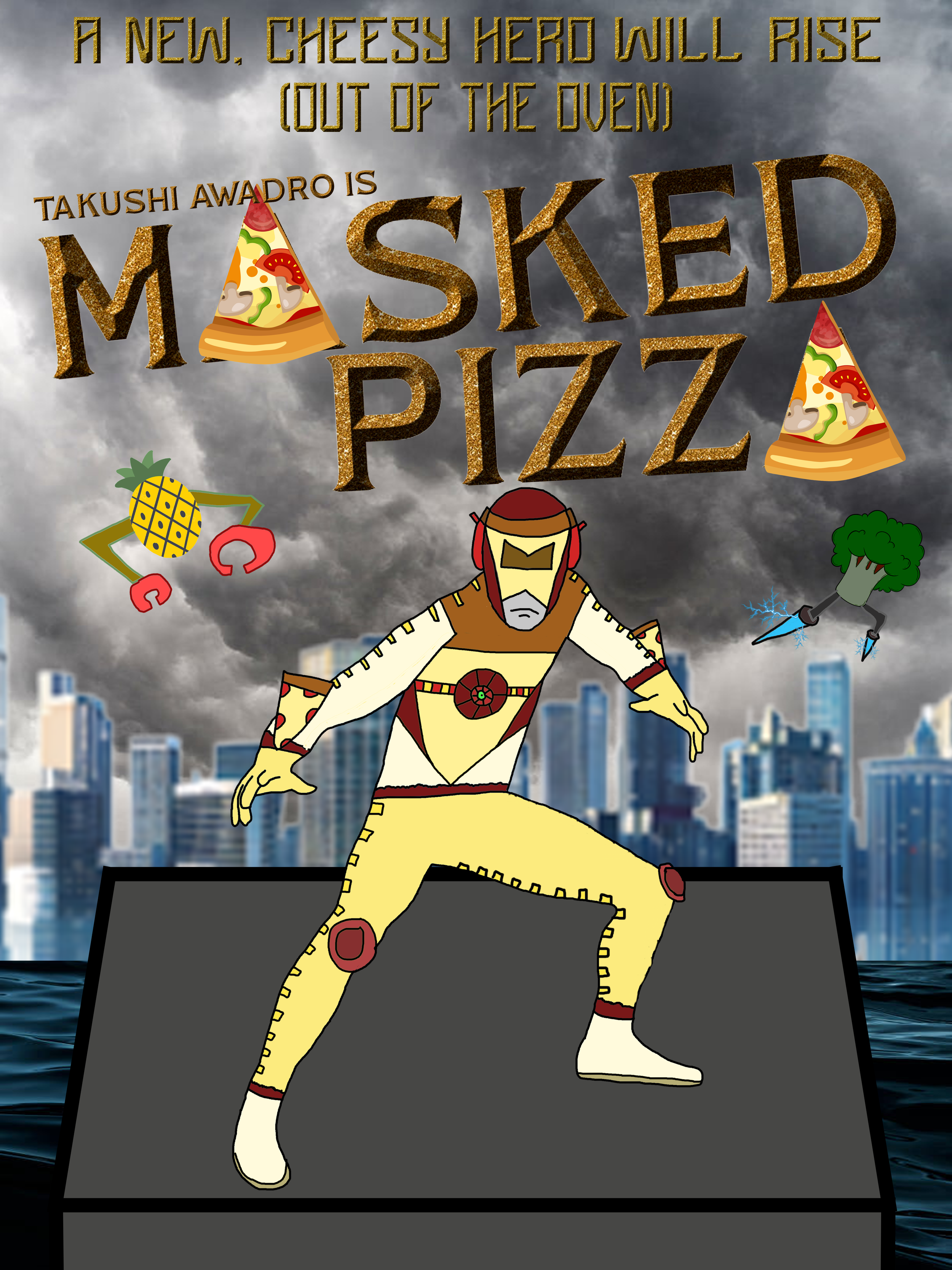
Film Poster Concept
“Masked Pizza” Movie Poster
The cinematic poster explores dramatic typography and thematic symbolism. The design uses stylized lettering, illustrated elements, and a dark atmospheric background to convey narrative intrigue.
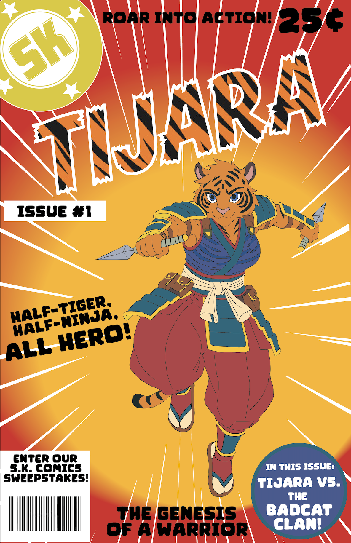
Comic Book Cover
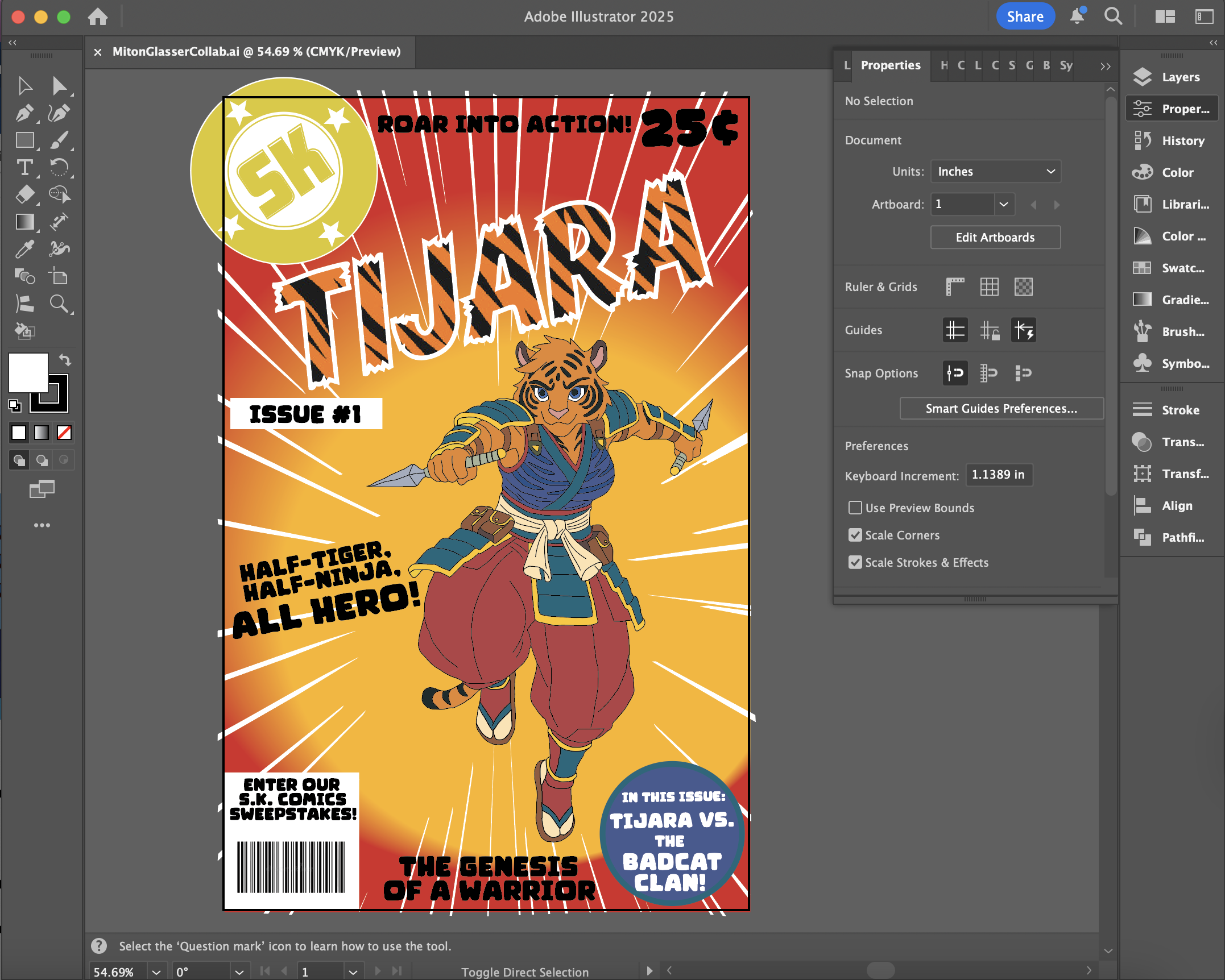
“Tijara” Issue #1 Cover
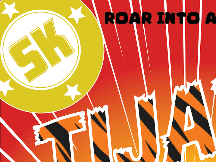
The comic cover showcases character illustration combined with bold graphic elements. Dynamic composition, bright colors, and exaggerated typography reflect the energy typical of superhero comics.
Key Design Features
Across all designs, several features remained consistent:
· Strong typographic hierarchy
· Clear visual focal points
· Thematic color palettes
· Integration of illustration and typography
· Balanced layouts using spacing and alignment
These elements helped ensure that each piece communicated its intended message while remaining visually engaging.
Impact & Reflection
Project Outcomes
These projects played an important role in strengthening my understanding of visual communication and typography. Through experimentation, I learned how design decisions influence readability, engagement, and audience perception. Working across multiple formats—from editorial design to posters and infographics—helped expand my versatility as a designer.
The final designs demonstrate:
· Improved layout organization
· Strong typographic hierarchy
· More intentional use of color and visual contrast
· Increased confidence in combining illustration and graphic design
Collectively, the projects showcase my ability to adapt design principles across diverse visual media.

Learning & Growth
This design exploration taught me several key lessons:
· Typography plays a critical role in guiding viewer attention.
· Layout systems improve readability and structure.
· Iteration and feedback are essential for refining visual communication.
· Different audiences require different design strategies.
These insights have helped shape my design thinking and workflow.


Future Development
Moving forward, I plan to expand these concepts further by:
· Exploring advanced typographic systems
· Developing more cohesive brand identities
· Experimenting with motion graphics and digital layouts
· Refining illustration integration within graphic design
Continuing to study professional design work will also help strengthen my ability to create impactful visual experiences.
Retrospective
Looking back, these projects represent a meaningful stage in my development as a designer. They capture both my early experimentation and my growing understanding of design fundamentals. By studying typography, layout, and visual storytelling through both academic assignments and personal exploration, I built a strong foundation in graphic design principles.
These projects reflect on my evolving approach to design—one that values clarity, creativity, and purposeful visual communication.