Designing My Mascot
Overview
This special project explores the process of designing my original, custom-made mascot, which will be used to personify my graphic design brand. This mascot acts as an iconic symbol of my creativity, blending my love for graphic artistry with my lifelong fascination with the Japanese tokusatsu genre, pop culture and video games.
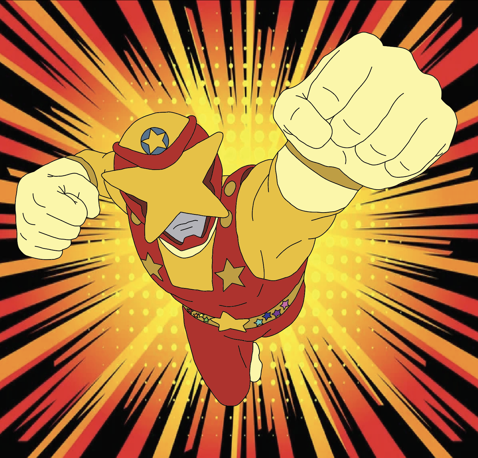
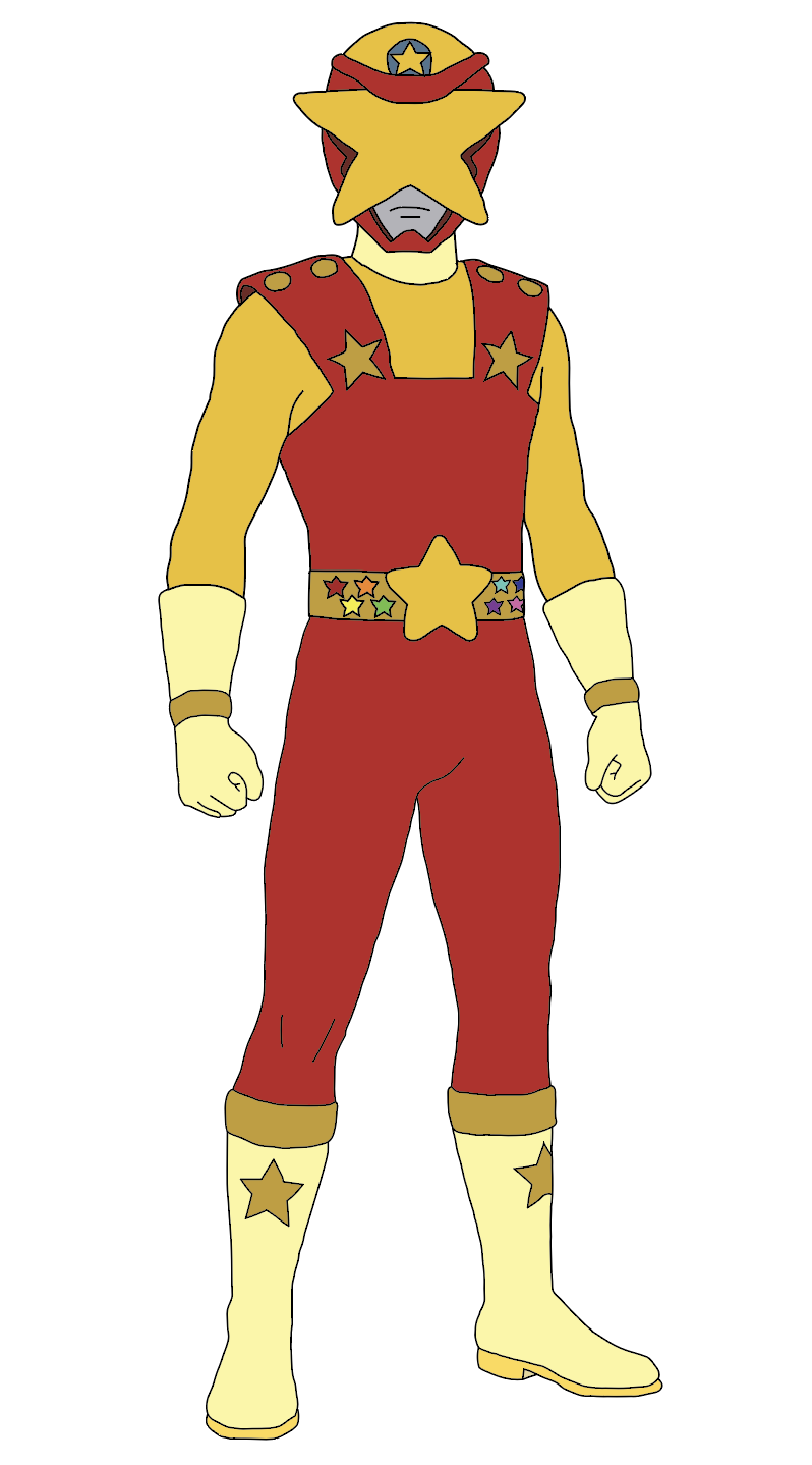
The resulting mascot features a heroic figure centered on the theme of stars, rendered in a rich palette of red, yellow, and gold tones. This mascot was designed in Adobe Illustrator.
Role: Graphic Designer | Timespan: Spare Time | Platforms Used: Illustrator
THE Problem
In furthering my brand image, I realized the importance of an identifiable mascot or logo to set me apart from others. Although my graphic design work reflected technical ability and creativity, there seemed to be no single component that would unite these elements into a coherent brand image.
The absence of a mascot or anything that would make me stand out meant that my brand could become lost among others.
Problem Statement
In what ways can I develop and create an innovative mascot that is visually distinctive, represents myself, my personal passions, aligns with my branding, and acts as a symbolic representation?
THE CHALLENGE
Aesthetically speaking, the main issue was to blend several styles into one design—namely, the influence of tokusatsu aesthetics, a touch of gaming nostalgia, and a modern branding approach.
Important factors were:
Creating an emblematic figure that would look exciting but not be too complicated.
Making it versatile and usable in different contexts, such as branding, advertising, social networks, etc..
Using strong outlines and contrasting colors;
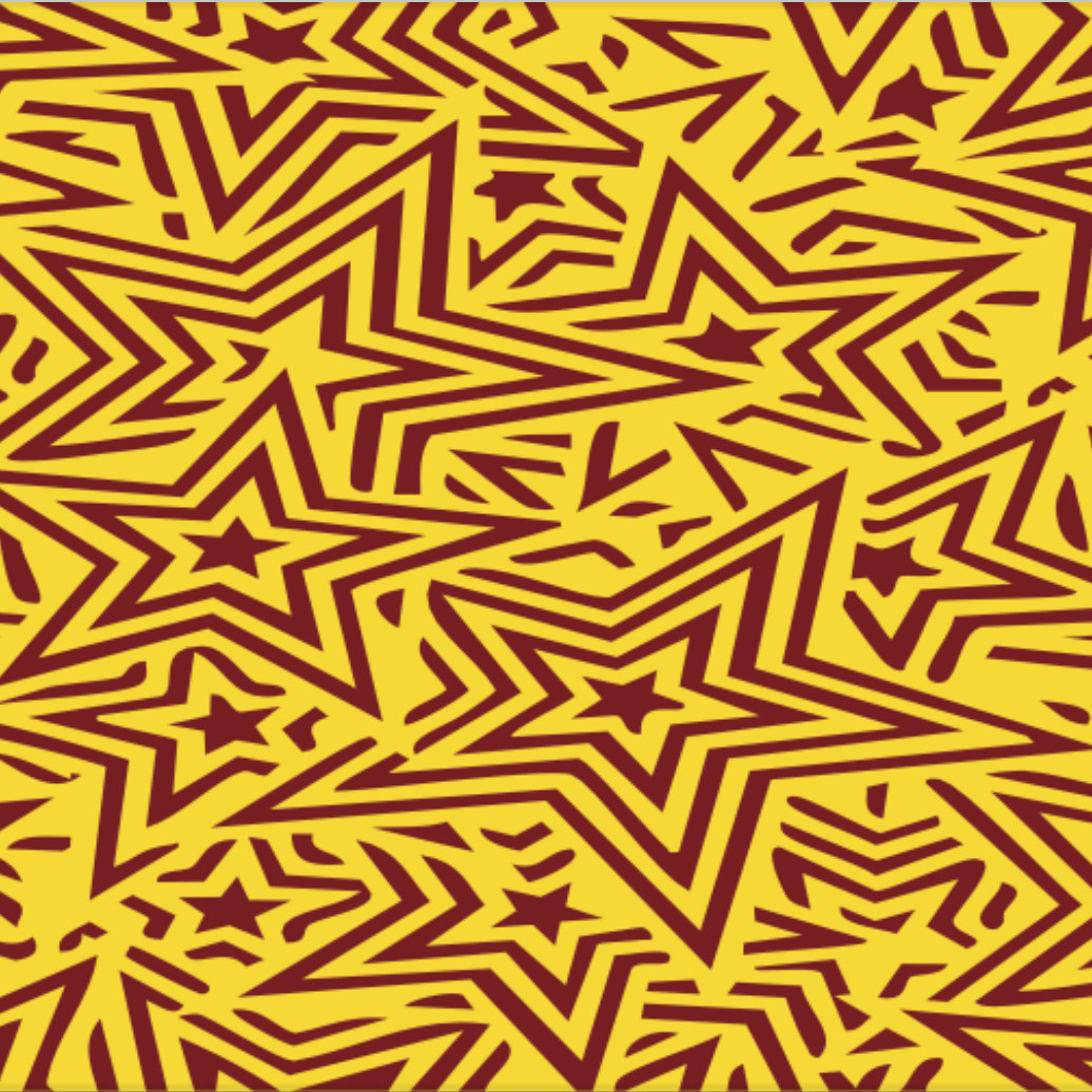
Incorporating the star shape, which is the key element of my brand.
THE PROCESS
USER RESEARCH
While this project is focused on personal branding, I have considered what to expect from my target audience:
An audience that loves stylized character designs
People who understand pop culture visuals, such as action heroes and gaming characters
Potential clients who seek designers whose work is daring, innovative, and full of personality
What was learned:
Characters with distinct silhouettes leave stronger impressions
Themes that recur (e.g., using the same shapes or symbols) help build identity
Vibrant, contrasting color schemes stand out more
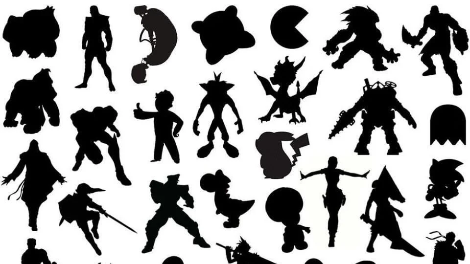
Competitive Analysis & Inspiration
Design approaches used for character design were explored in various contexts:
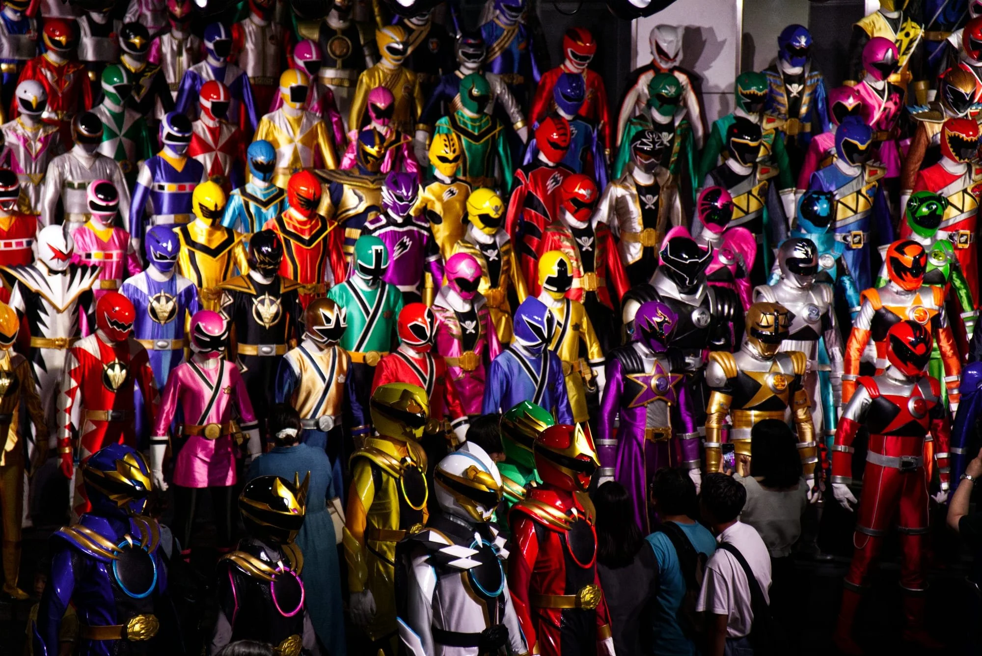
Tokusatsu characters are known for their bright costumes, helmets, and themes
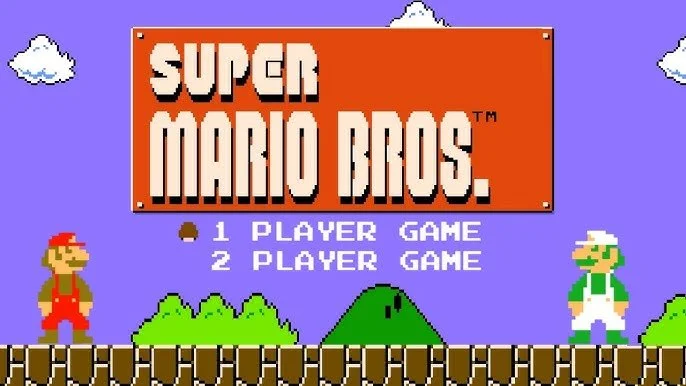
Characters from retro video games are noted for their simplicity and color blocking
Current design mascots employed by both designers and companies
Key learnings:
Simplicity makes it versatile
Repetition of a symbol adds to its identity
Visual hierarchy increases legibility
This knowledge was incorporated into the creation of the mascot, especially regarding the use of the star theme and suit design.
VISUAL DESIGN STRATEGY
The three main pillars that the visual approach was based on were the following:
2. Silhouette & Construction
The silhouette of the figure is chosen to be easy to recognize even when downsized, squashed, or stretched.
1. Shapes
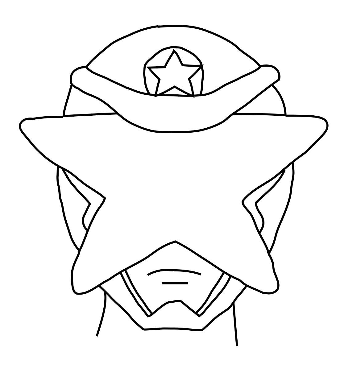
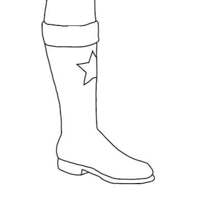
A star shape is used as the key visual that is featured prominently on the helmet, belt, chest area, and boots.
3. Color Scheme
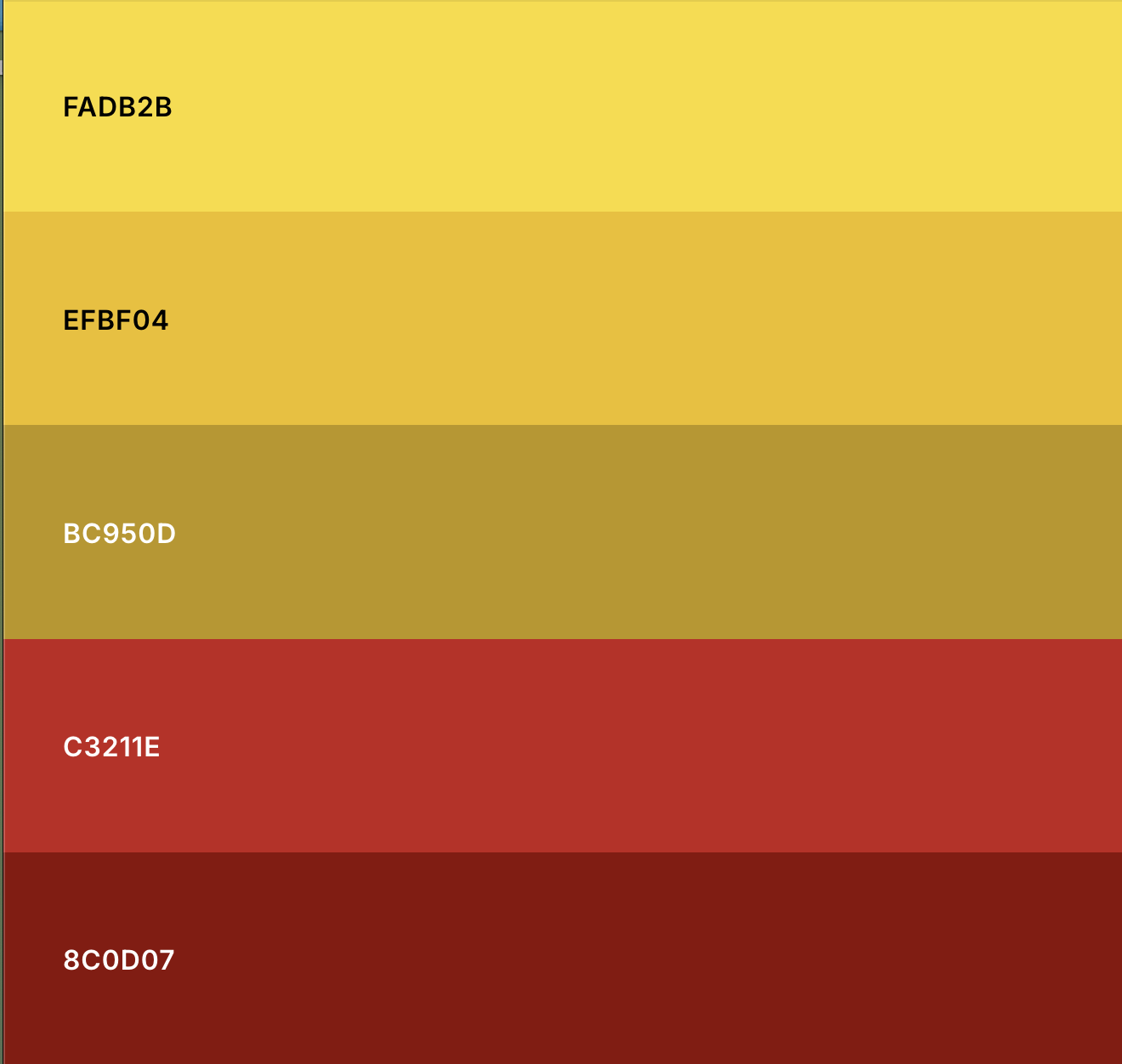
The choice of colors such as red, yellow, and gold is determined by my brand personality:
Red symbolizes energy and audacity
Yellow stands for creativity and optimism
Gold signifies value and prominence
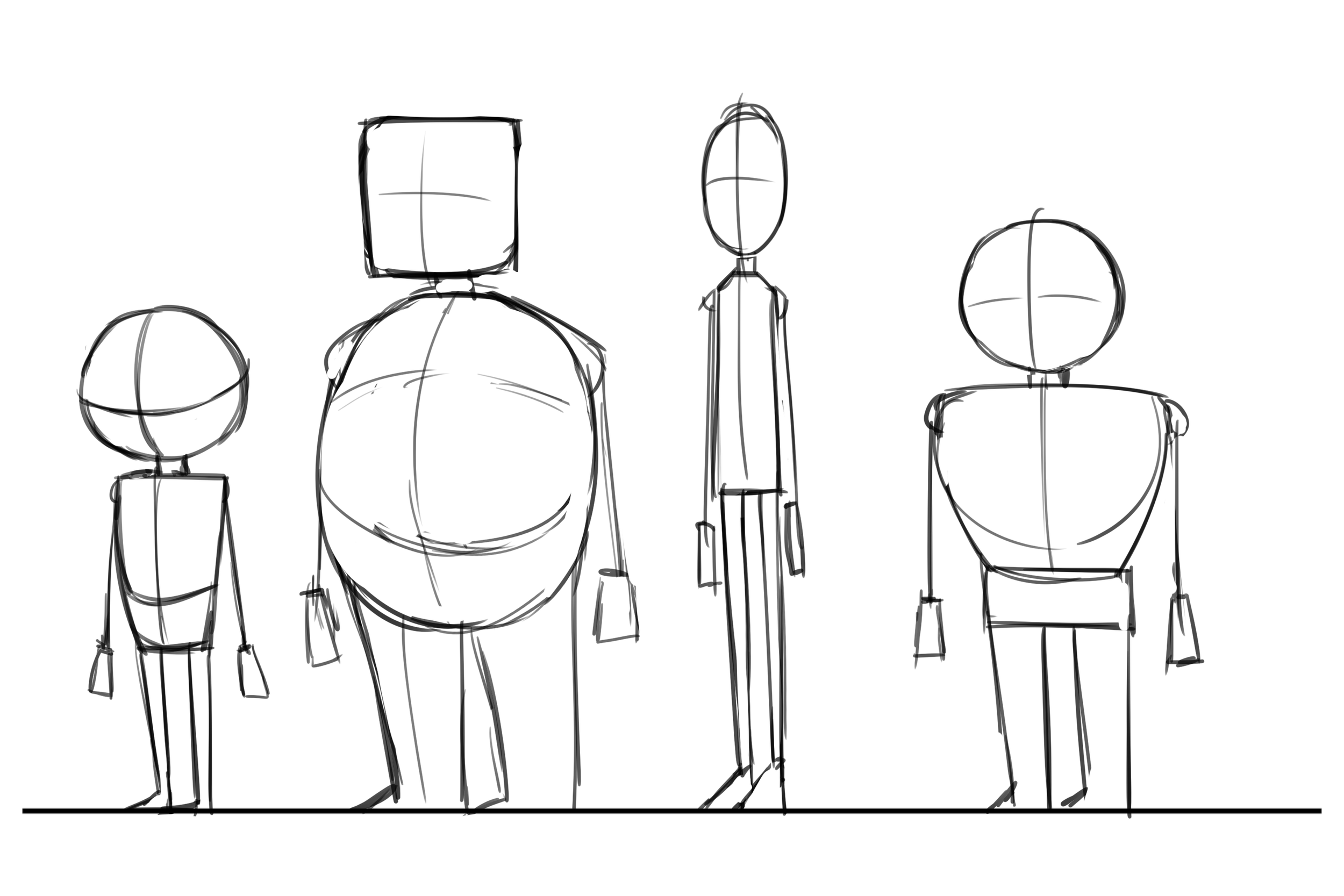
Prototyping & Iteration
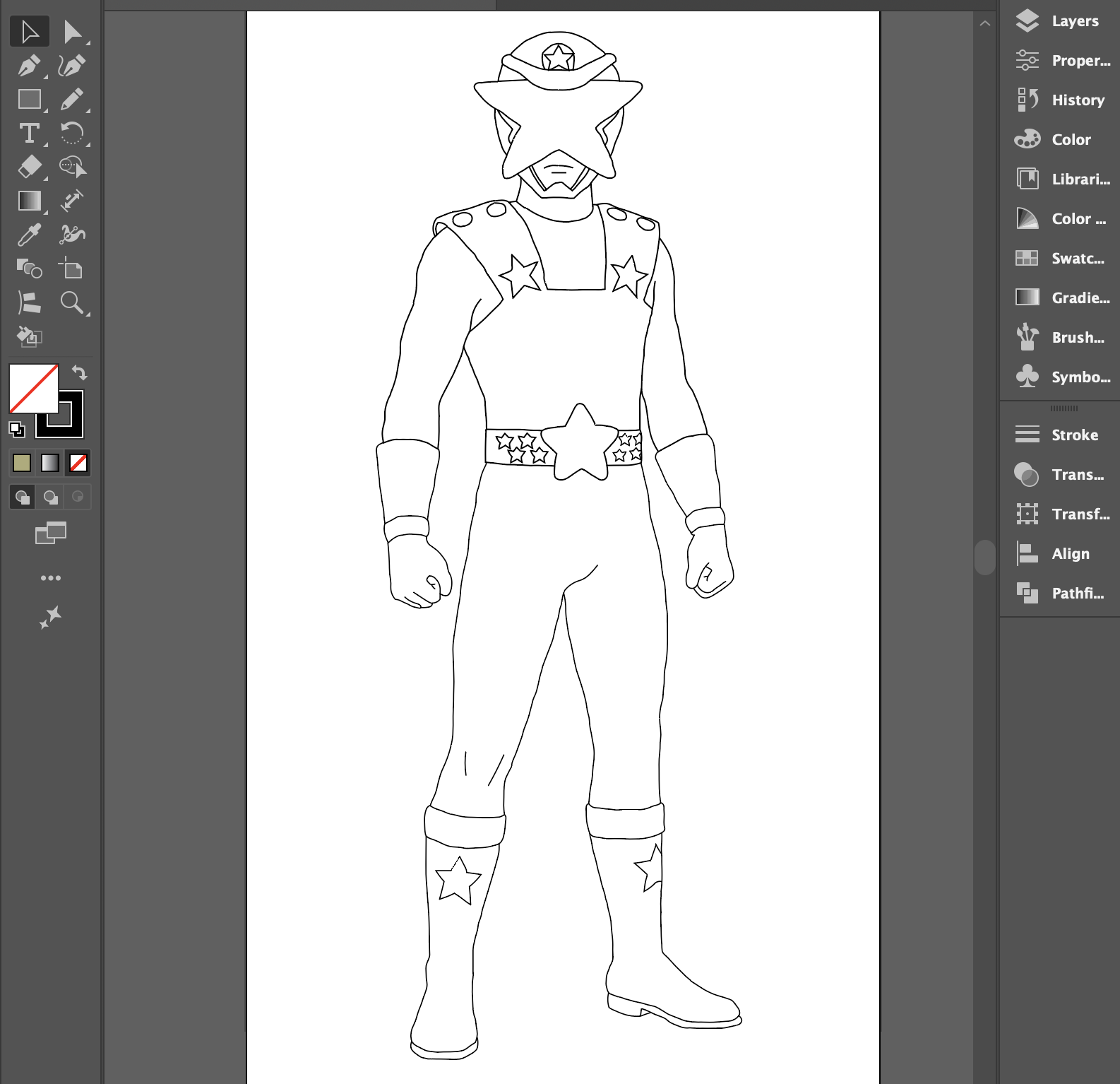
The process of designing included several steps within Adobe Illustrator:
Sketching Stage: Focused on working on proportions, pose, and symbol positioning
Shape Design: Transformed complex shapes into simpler and more geometric ones
Designing Motifs: Played around with motif placement and size
Color Adjustment: Made sure that colors balanced each other and stood out
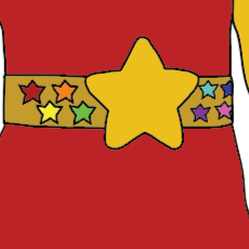
Details: Added minor details such as the stars on the belt and helmet, shoulder armor, and boots, to make the character look more interesting without making it too cluttered.
FINAL DESIGNS
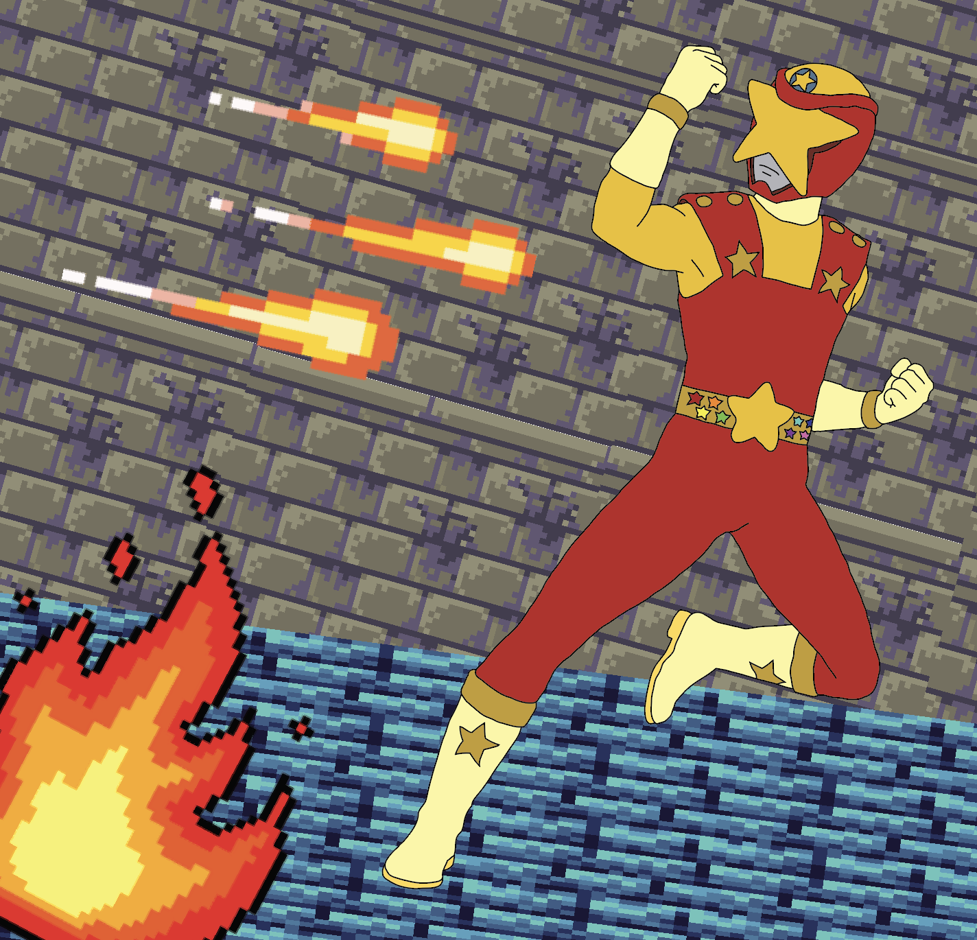
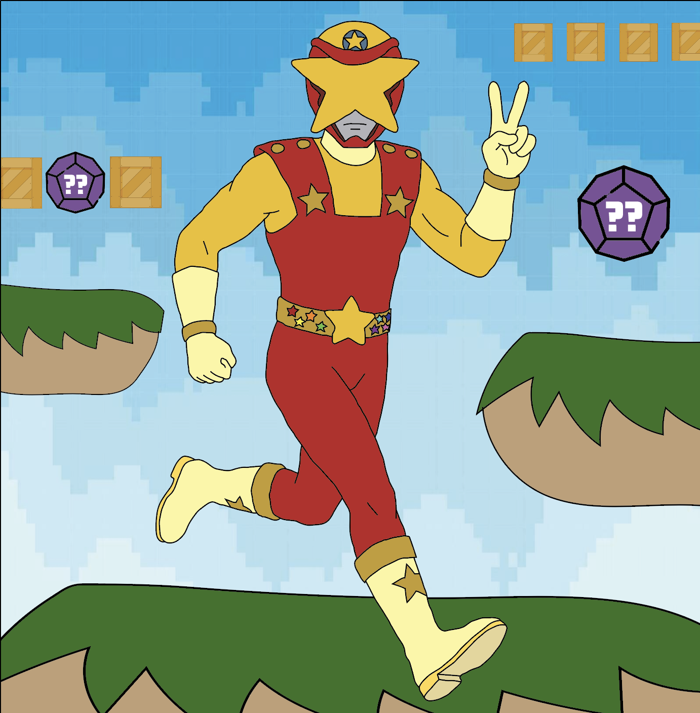
Spencer Klein Mascot (Final Design)
The finalized version of the mascot includes:
Helmet with a very bold star visor that instantly draws attention
Bodysuit with excellent color blocking
Incorporation of stars throughout the chest, waist, and boot areas
An upright and heroic posture
The vector rendering makes the design scalable and flexible for both digital and print purposes.
Key Design Features:
Star-Like Identity: A repeated design element that promotes brand awareness
Color Block Approach: Increases legibility and impact
Vector-Based Design: Ensures versatility on all media
Inspiration from the Hero: Translates to strength, creativity, and personality
Detail Balance: Enough detail to create interest, but not too much to impair functionality
Impact & Reflection
Project Outcomes
My mascot successfully creates a powerful visual image of my brand because it gives me:
An identifiable symbol that distinguishes my art from others
A flexible tool for branding and future marketing projects
An interpretation of my artistic inspirations and style
In addition, this project enhances my portfolio by giving it conceptual and practical aspects.
Learning & Growth
This project allowed me to gain insights on:
Character development in a branding setting
The significance of being consistent in visual branding
Finding the balance between personal inspiration and design concepts
The iterative process of designing in a vector environment
I have learned to transform conceptualization into visualization through this project.
Future Development
In my future work, I will further develop the image of the mascot by:
Designing more postures and scenarios for my mascot to interact in
Creating animations or motion graphics
Designing different versions depending on the occasion
Introducing the mascot to corporate design elements like logos and merchandise
All of these steps will contribute to the further development of the mascot.
Retrospective
In retrospect, this process played a crucial role in helping me develop my personal brand. The task required me to think deeply about who I am, what symbols represent me, and how people see me while remaining faithful to my creative inclinations.
The end product is a mascot that embodies my personal brand and reflects my love of design, storytelling, and creative expression.