Typography Studies
Overview
This type of project represents an explorative investigation centered around the study of the typeface Bodoni. The aim of the task was to investigate the characteristics of the Bodoni typeface and present them in a booklet created in Adobe InDesign.
The outcome is a neat, editorial-looking booklet that utilizes hierarchy, grids, and other type layouts to convey information visually. The focus is on readability, clear contrasts, and elegance—all the traits that characterize the Bodoni typeface.
Role: Graphic Designer | Timespan: College Years | Platforms Used: Adobe Indesign
THE Problem
Typographic design is generally studied in an informative fashion, devoid of visual interest and real-world applications. Most typographic sheets do not adequately balance readability and design flair, preventing the viewer from truly comprehending a font's purpose and character.
A need arose to produce a work that would not only inform but also show how typography could be used as content and design.
Problem Statement
What is the best approach for creating a typographical book on the history and classification of the typeface Bodoni that would best demonstrate its aesthetics through layout?
THE CHALLENGE
The main problem faced was the need to balance two conflicting factors:
Providing well-organized information
Designing appealing page layouts by employing a consistent typeface
As the entire project depended on the use of one typeface family, the only way to create contrast was through variations in size, weight, space, and arrangement.
THE PROCESS
USER RESEARCH
The audience for this book will include:
Design students studying type theory
Young designers investigating type categories
Teachers requiring educational visuals
Findings suggested that users found the greatest value in:
Hierarchy and legible body copy
Visuals (example alphabets, numerals, variants)
Brief historical overview
Interactive designs illustrating the application
It was therefore deemed appropriate to incorporate information and typography.
Competitive Analysis & Inspiration
I explored conventional typographic specimen books, editorial pages, and typography exhibitions. Important findings were:
Conventional specimens place much emphasis on layout structure, but may come across as stiff
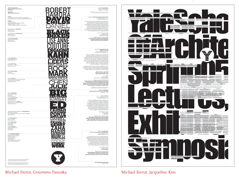
Editorials employ techniques such as scaling and white space to create a rhythmic visual flow
Typography exhibitions emphasize innovation and abstraction
My inspiration came from high fashion editorial pages and Swiss design concepts.
VISUAL DESIGN STRATEGY
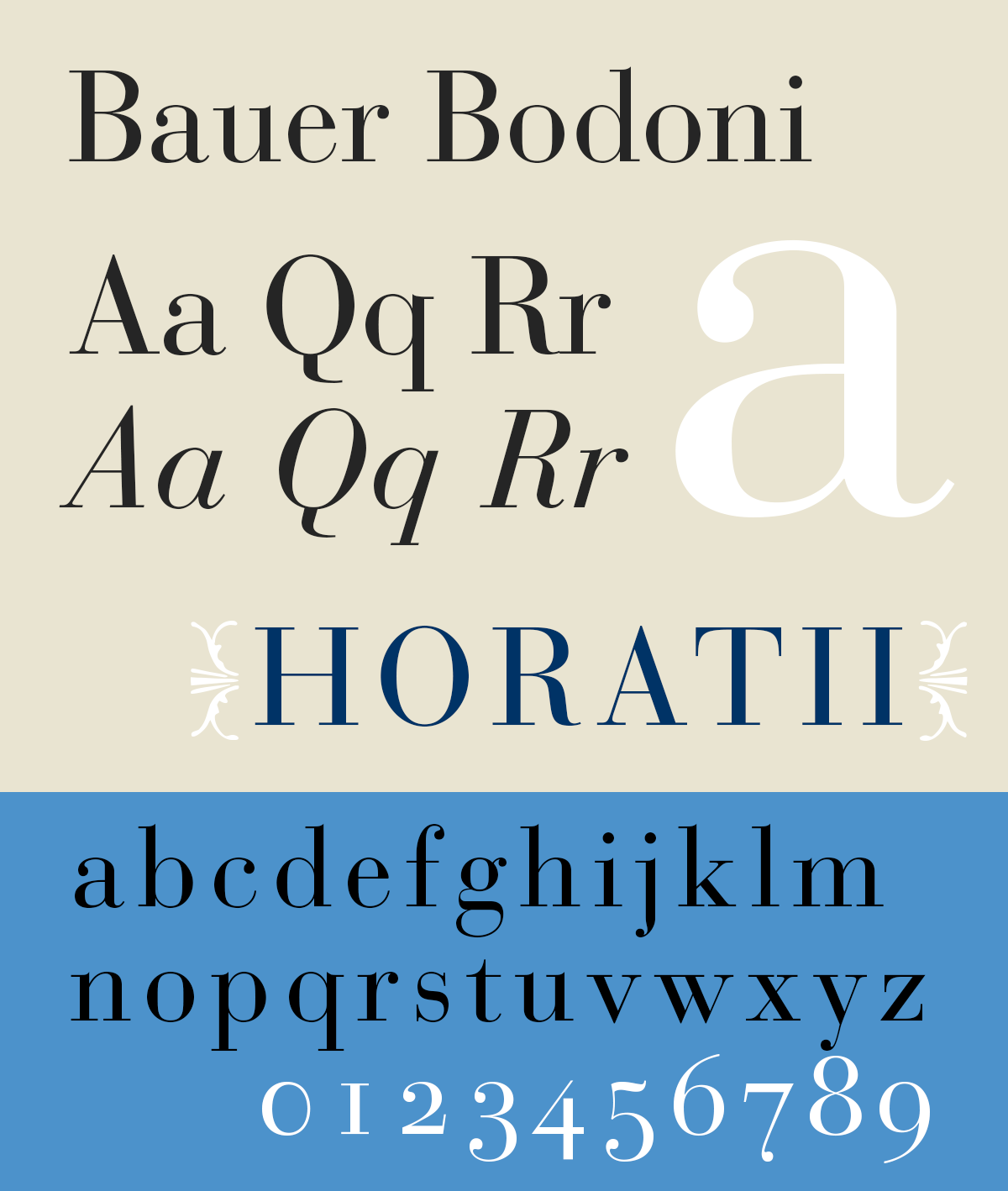
The conceptual approach focused on capturing the essential qualities of Bodoni:
Extreme contrast between thick and thin strokes
Refined and elegant forms
Vertical emphasis

The core principle of the page design of this project alternates between informative and typographic elements.
This was achieved through:
Large-sized letterforms as visual references
Color selection limited to black, white, and a subdued blue hue for elegance
Grid systems for proper layout organization
Effective use of whitespace for clarity and focus
Prototyping & Iteration
Steps taken during the design process using Adobe InDesign:
Drafting stage: Basic layout design and text placement.
Intermediate stages: Experimentation with scale, hierarchy, and alignment.
Final stages: Improvements in spacing, contrast, and consistency.
Changes made include:
Increased contrast between headings and body text.
Alignment optimization for better grid design.
Readability improvement in areas with dense text.
Use of dynamic designs with oversized letterforms.
FINAL DESIGNS
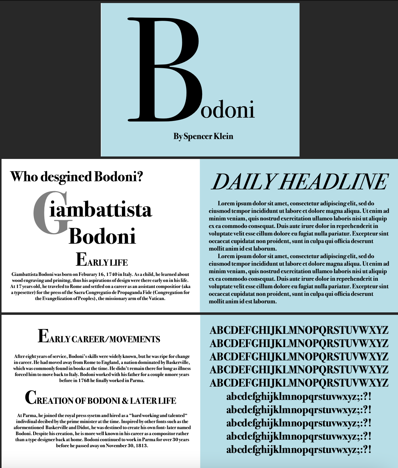
Bodoni Booklet
The last booklet consists of a number of organized but visually stimulating pages:
Title page with an eye-catching heading for Bodoni
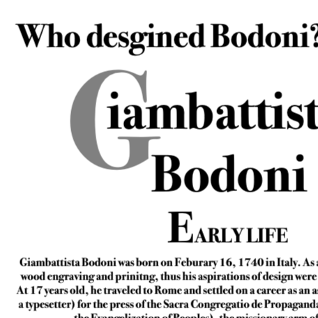
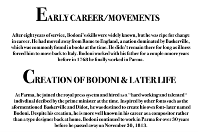
Informational pages discussing the designer and background information
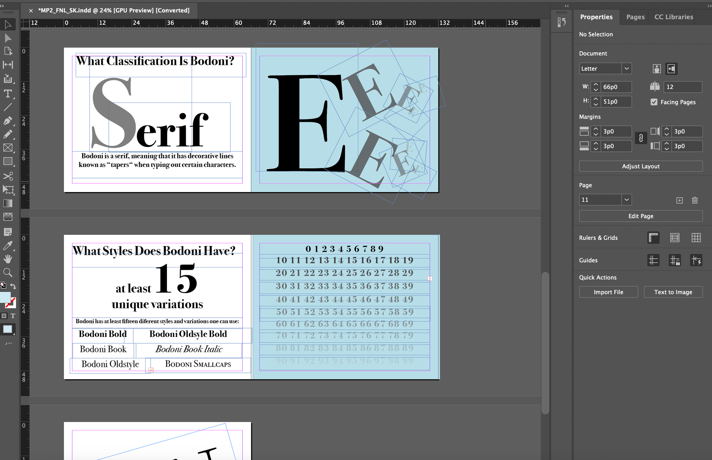
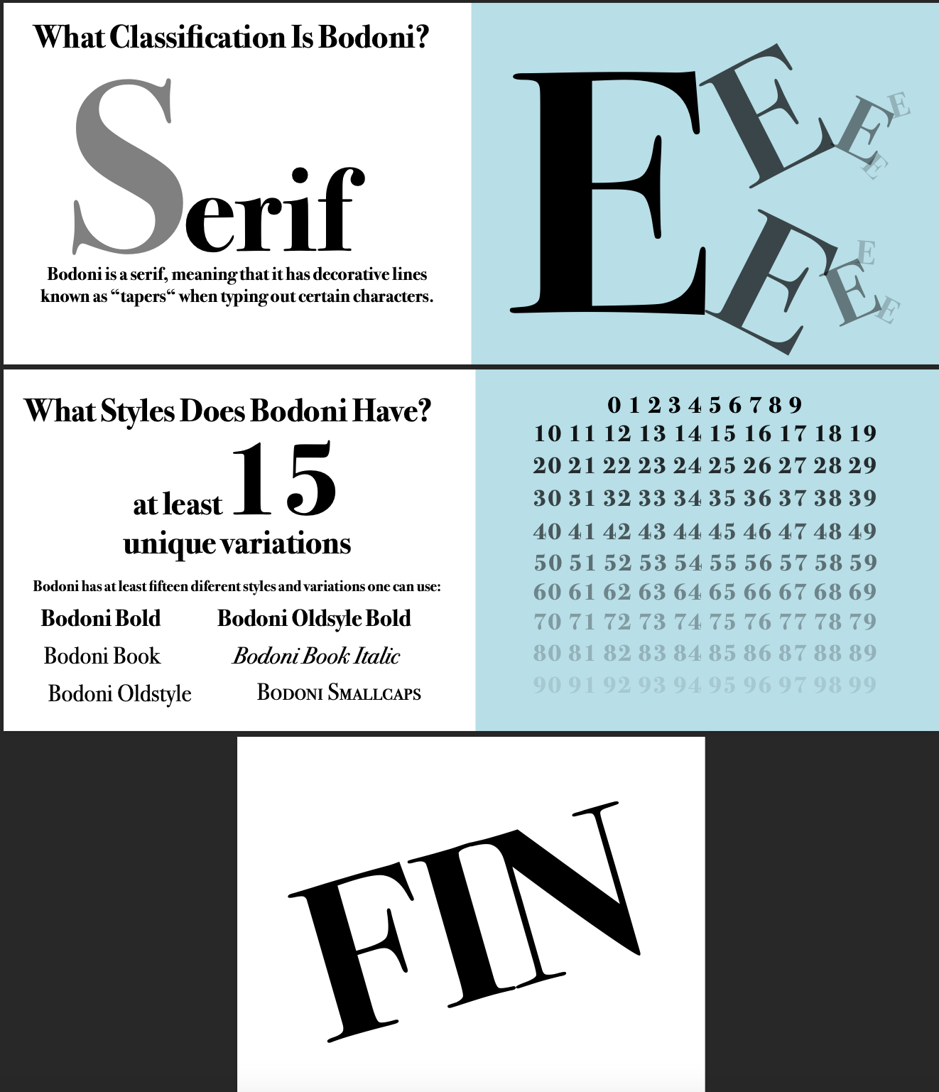
Classification page with Bodoni being identified as a serif typeface
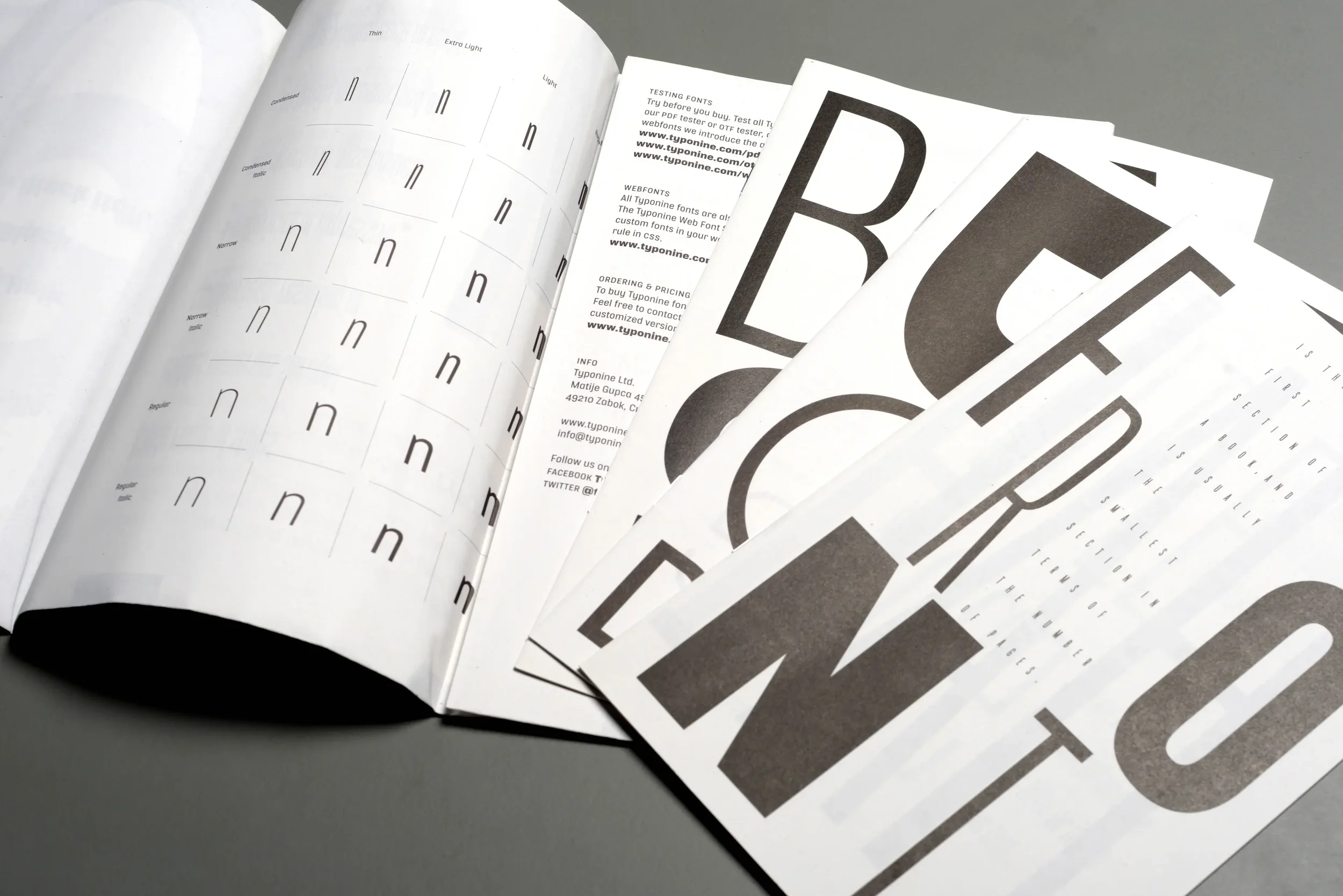
Styles and variations pages with various types and shapes of Bodoni
Pages with alphabets and numerals in full form
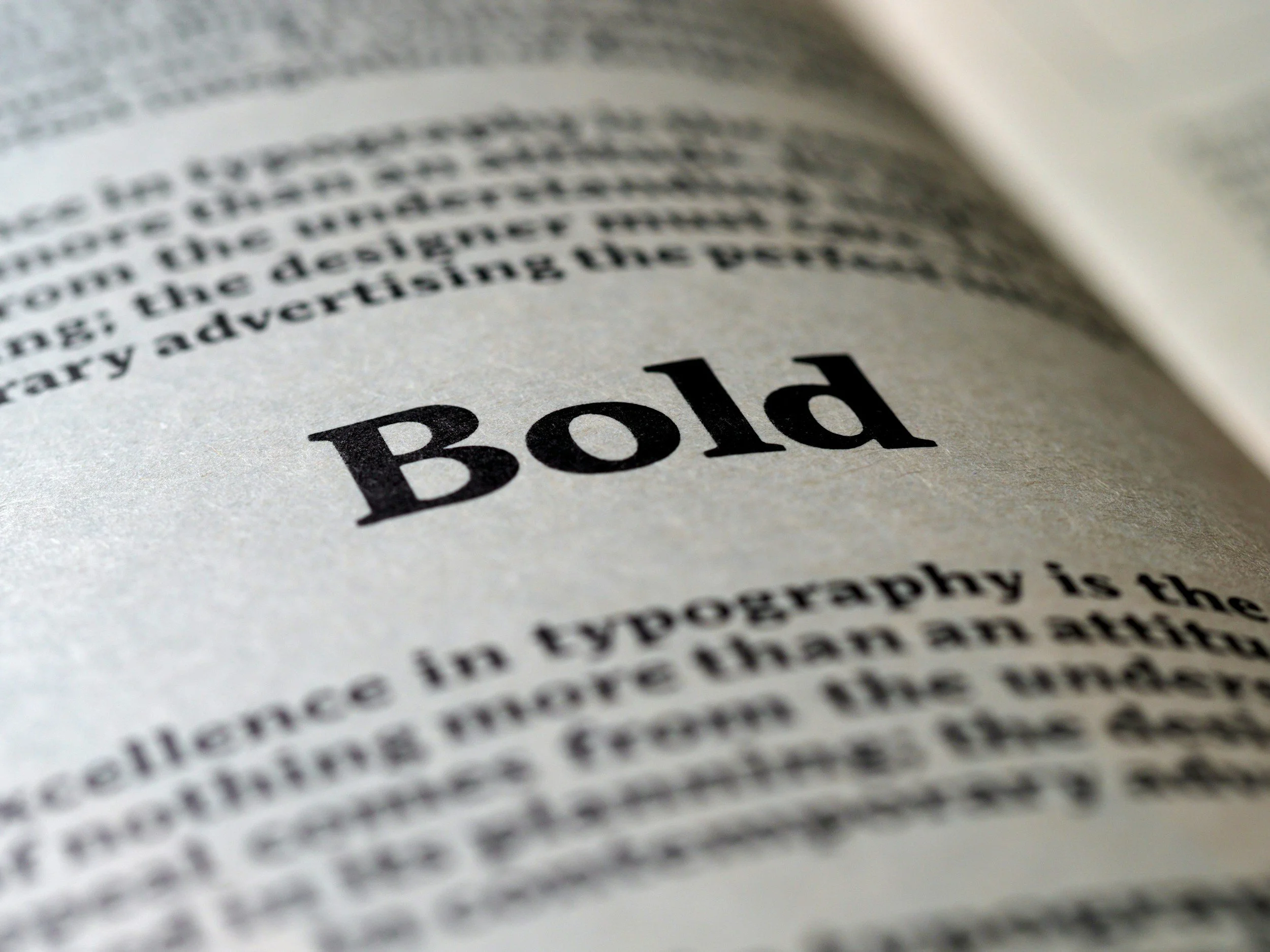
Typographic designs made with large-sized letters
Key Design Features:
High Typographic Hierarchy: Distinction among headings, sub-headings, and body copy
Grid-Based Layout: Alignment and spacing on all spreads
Scale Contrast: Employing large letters for creating focal points
Color Palette: Fewer colors contribute to sophistication
Type as Image: Letters as design element rather than mere text
Visual Cohesion: Throughout the entire book
Impact & Reflection
Project Outcomes
The final booklet does a good job of:
Presenting vital information about Bodoni in a clear manner
Showing an appreciation of the principles of typographic hierarchy
Showing how a typeface can be creatively utilized
Maintaining legibility while being experimental
This assignment acts as a crucial learning and creative exercise in typography.
Learning & Growth
This project helped me gain:
An increased knowledge of typography classification and history
Enhanced proficiency in creating layouts and grids
Increased competence in typography usage as the main design tool
Enhanced focus on spacing, alignment, and hierarchy
Another lesson learned was that minor changes in scale and spacing could greatly affect visual communication.

Future Development
If I had more time, I could further enhance my work by:
Including more fonts to compare their characteristics
Developing digital elements (such as motion graphics)
Trying out more experimental page designs yet keeping legibility in mind
Print-ready production of the booklet
Retrospective
It reiterated the significance of making careful choices when designing typographically. This project has shown me that when restricted to a single font family, I would have to be creative and innovative in my designs.
In conclusion, this booklet demonstrates the application of both precision and innovation in design.