PhotoGraphy
Overview
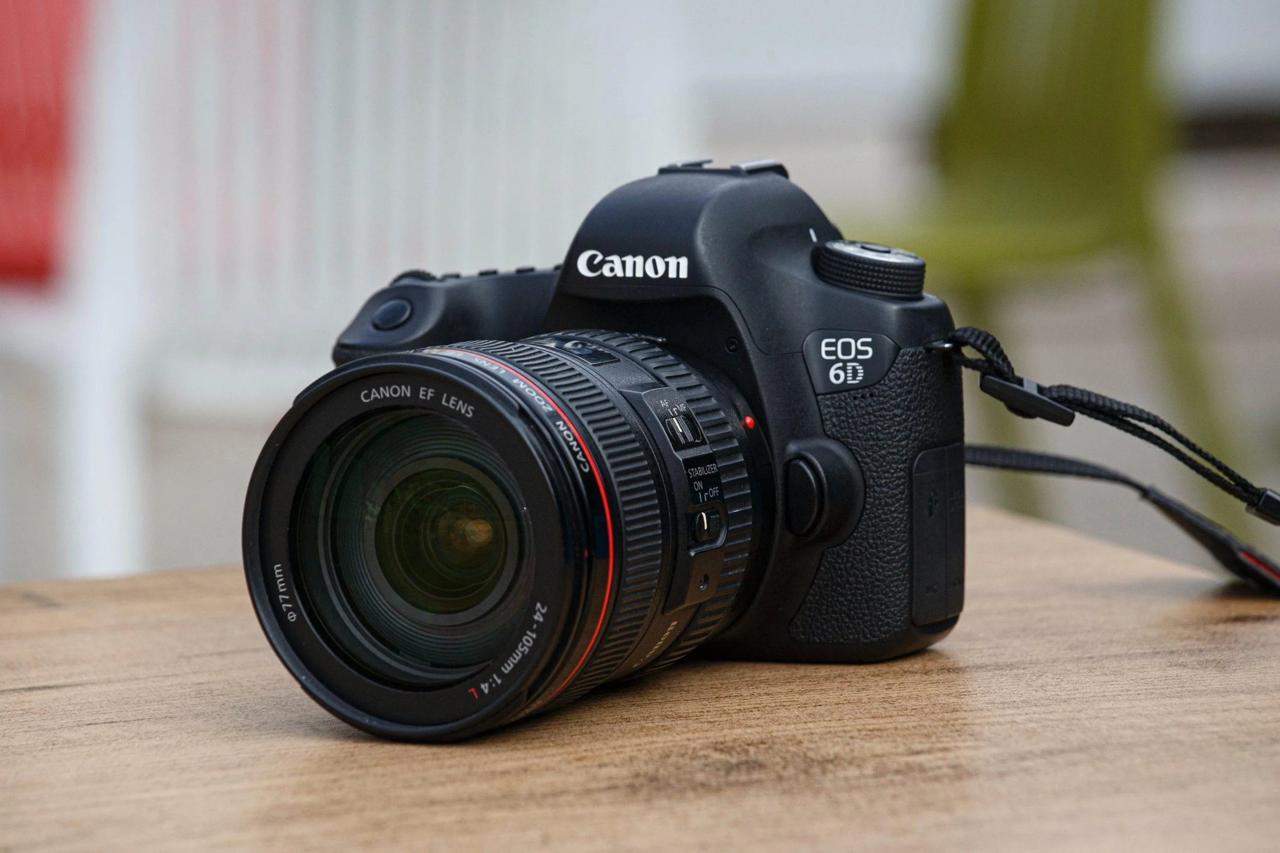
Through this page, my journey in understanding photography as an element of design – that visual communication is not limited to digital illustrations or Photoshop, but exists just as powerfully in the practice of observing and capturing an image – is captured. Working with a Canon DSLR and using very little Photoshop editing, I completed five individual projects that emphasized different aspects of the visual language. From painting light on the road at night to arranging stones in the shapes of my own initials, to creating a self-portrait through a mirror reflection – each was a genuine process of design.
Role: Graphic Designer | Timespan: College Years | Platforms Used: Canon Camera, Photoshop(Minor Edits)
THE Problem
Photography is a medium that is both immensely accessible and difficult at the same time, far more difficult than drawing. Unlike illustration, the camera cannot create an image out of nothing; it can only choose. Choosing where to take a picture from, choosing what should be included in the frame — all of this is extremely difficult, if not impossible.
In this regard, the primary issue I had to deal with was how to build a language, a visual language, on a medium so heavily constrained by its technical characteristics. How could I learn to produce pictures that would mean something and not merely be technically sound and perfect?
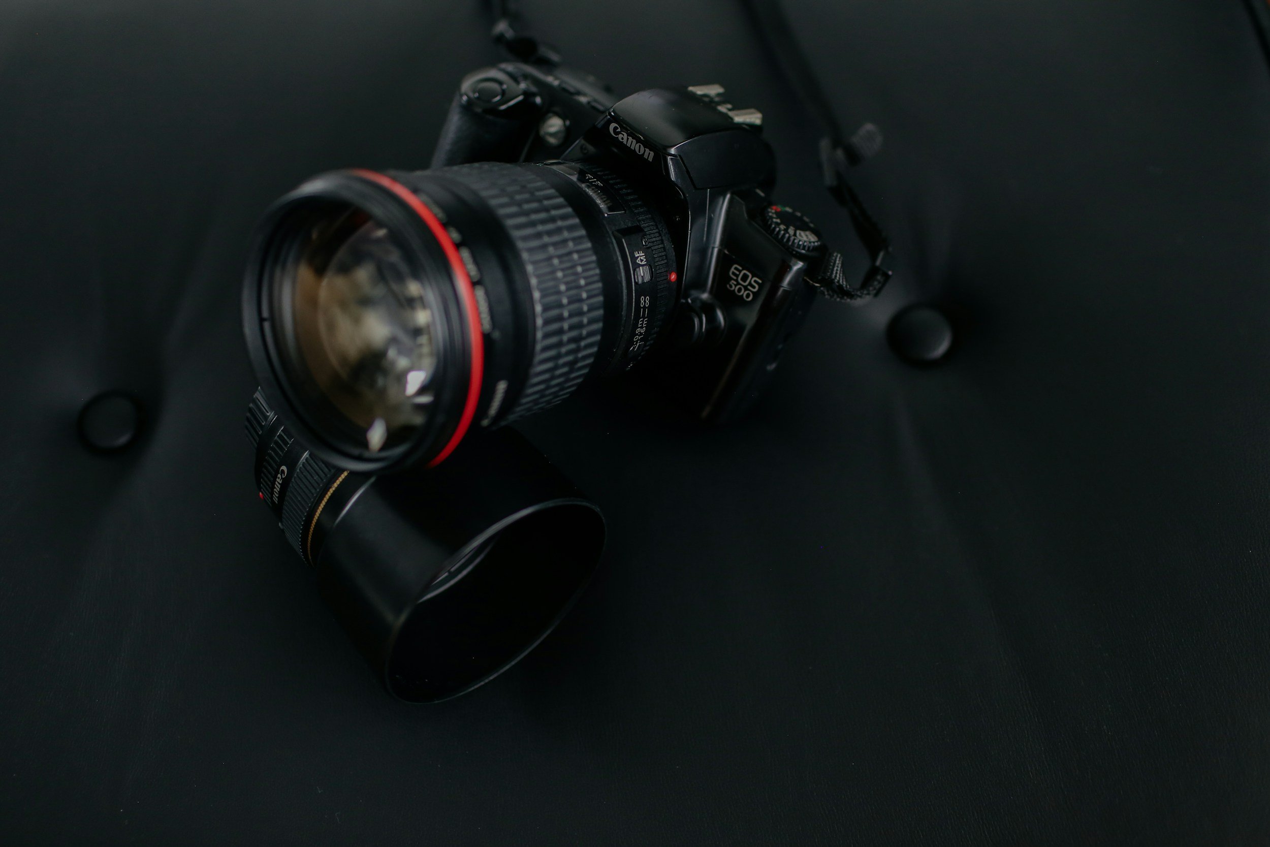
Another important factor was the actual camera I had to work with. As a Canon digital single-lens reflex camera, it certainly offers many possibilities, including control over aperture, shutter speed, and focal length. At the same time, this camera requires some expertise and skill that I have to acquire through practice and test shooting. Furthermore, the choice of subject matter is quite limited; my options include my own dorm room, my food, and the sidewalk outside my house.
Problem Statement
How does one go about using their skills with a single camera within an environment that imposes many limitations, in order to develop an artistic language, to create aesthetically appealing pictures without resorting to extensive post-production processes?
Limiting the use of Photoshop to make small adjustments implied that the artist had to get everything done prior to taking the photo. This is the essence of photography: capturing perfect shots.
THE CHALLENGE
Each of these five photographic assignments posed unique visual challenges:
01 — Light Painting at Night: Motion Becomes Form. This project presented the challenge of how to use the long exposure time to render a moving car as an abstract form.
02 — Stone Typography: Constructing Graphic Meaning from Found Objects. This project presented the challenge of how to arrange stones to form letter shapes while retaining their organic qualities.
03 — Mirror Self-Portrait: Self-Reflection through Photography. This project presented the challenge of how to use a mirror as a way to both uncover and disguise myself in a photograph.
04 — POV Dorm Room: Creating Intimacy Through Photography. This project presented the challenge of how to turn an everyday space into a purposeful one by photographing it in the first-person point of view.
05 — Pizza Macro Close-Up: Extreme Distance From Reality. This project presented the challenge of how to get so close to the surface of a pizza that its texture takes on graphic form far from any recognizable reality.
THE PROCESS
USER RESEARCH
The main audience consisted of peers in graphic design and visual arts, as well as viewers viewing the images in the context of their portfolios. Throughout the process of creating and sharing my images, there were some common perceptions and insights.
In design-oriented audiences, viewers respond very positively to images with compositional elements and deliberate decisions behind them. The audience is more concerned with the image's formal qualities (lines, textures, contrasts) than with its actual subject matter. Another feature that appeals to such viewers is complexity: they find it rewarding to analyze the image and discover its elements bit by bit.
One insight from that audience was the following: people interpreted the stone initials picture in the most literal way possible, assuming it was just a composition of lines. Once I revealed its true nature – the initials of mine – people saw it from a completely different angle, realizing that the picture had multiple meanings and conveyed something about my personality as well.
Another interesting reaction came from the peers who viewed my self-portrait. People liked its ambiguity because they perceived it as an intentional decision rather than an accident.
Competitive Analysis & Inspiration
The visual references used to inform my research included both historical art photography practice and contemporary practice, with an appropriate connection.
The light trails have been heavily influenced by the long-exposure techniques used since the time of Man Ray, as well as the "light graffiti" practice developed throughout the 80s and 90s – all of which showcased the use of extended exposure as a means of translating kinetic energy into graphical elements.
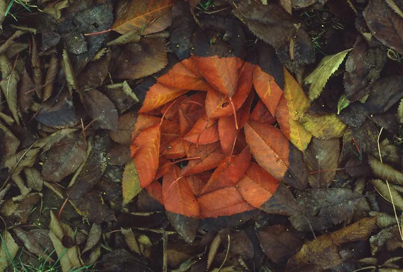
The stone initials have been heavily influenced by the work of Andy Goldsworthy, whose use of natural elements to create temporary sculptures in specific locations directly relates to the concept behind this piece.
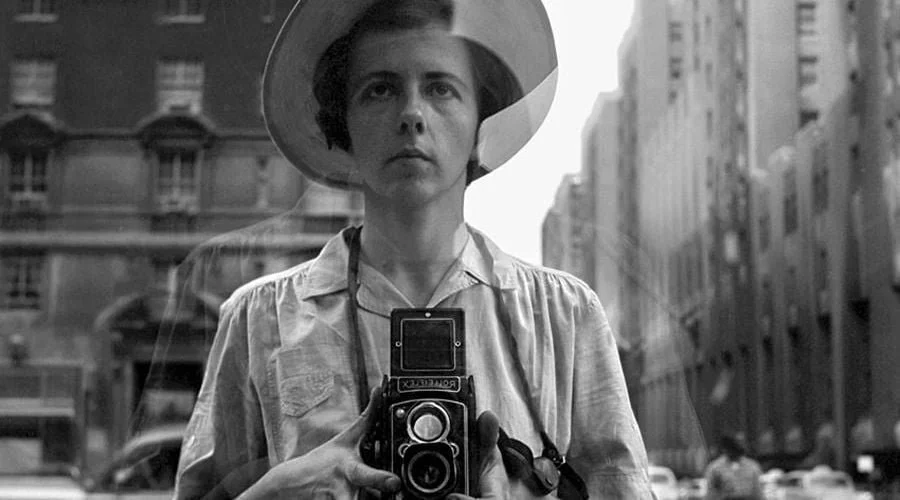
The self-portrait has been heavily influenced by the work of Vivian Maier – specifically her mirror self-portraits, where the camera and partially hidden face of the artist herself is used as a subject matter.
The dorm room perspective was informed by the vernacular photography practice that documents everyday events as subject matter.
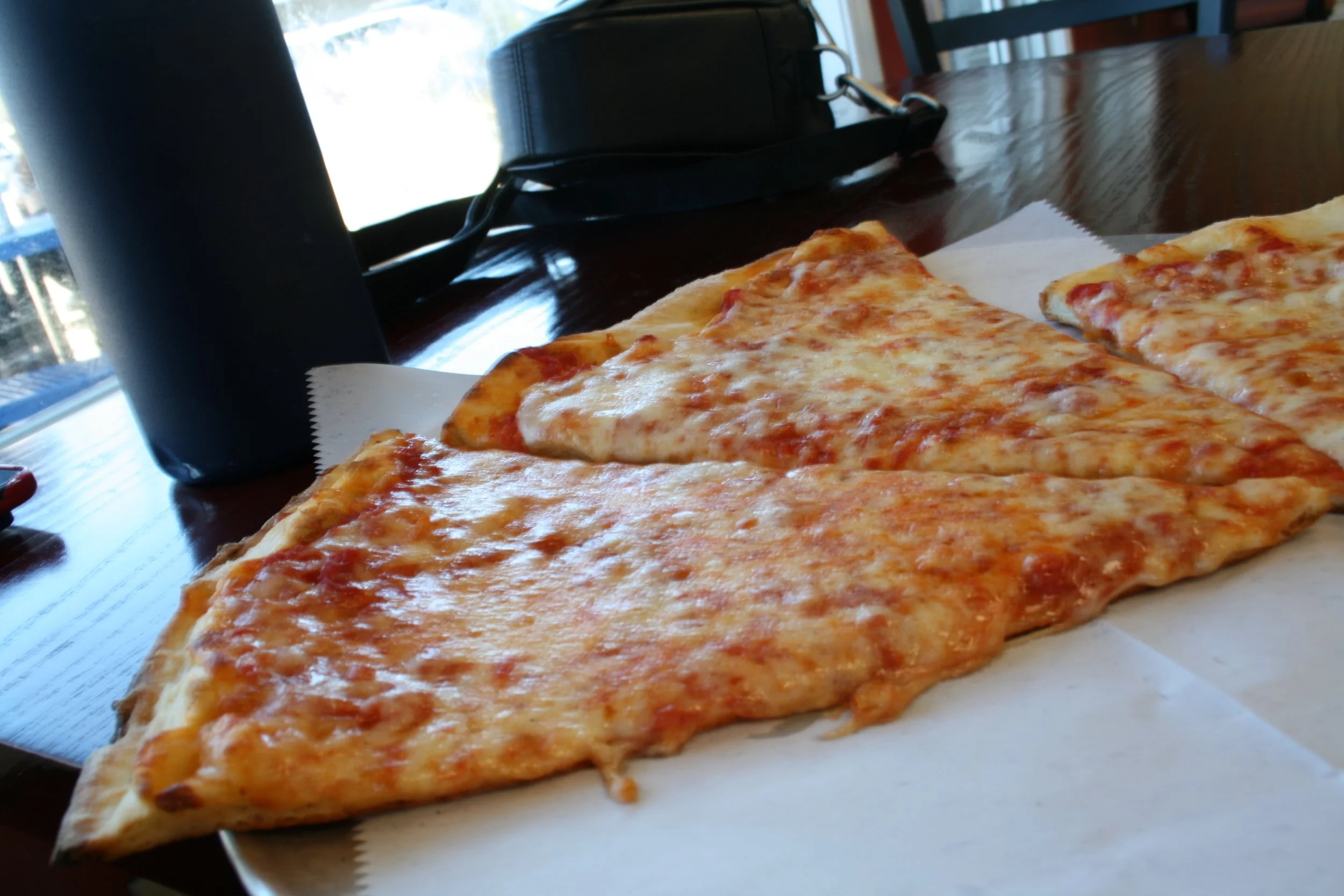
The pizza macro was greatly influenced by the food editorial photography practice, where the texture and color become the most important aspects rather than the ingredients used in the pizza.
VISUAL DESIGN STRATEGY
The process of combining five diverse images relied on the principle I would call unity achieved through contrast. Instead of creating five images that would be somewhat alike, my idea was to utilize the diversity of subjects and see unity in the way all five images deal with such concepts as light and darkness, details and abstraction, familiarity and surprise.
Secondly, there is an element of texture in all five pictures. Stones, asphalt, crust, cinder block, cheese - surface qualities of the objects became the focus of each picture.
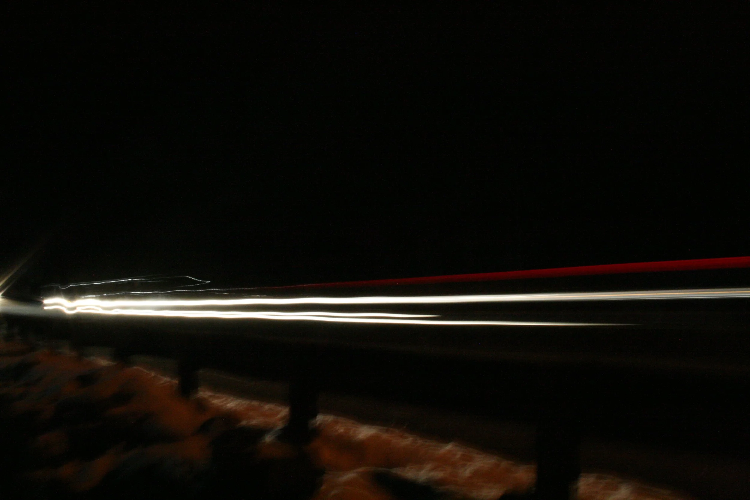
There are two things that are consistent across all five images. The first is the presence of light and dark areas within each picture. In fact, one can easily see a gradation between the darkest and the brightest areas of the pictures, and the positions of the latter become the organizing principles of the compositions. It is in the light trails visible on the dark sky in the first picture, and in the bright patches of the cheese in the picture of pizza contrasting with the dark red sauce.
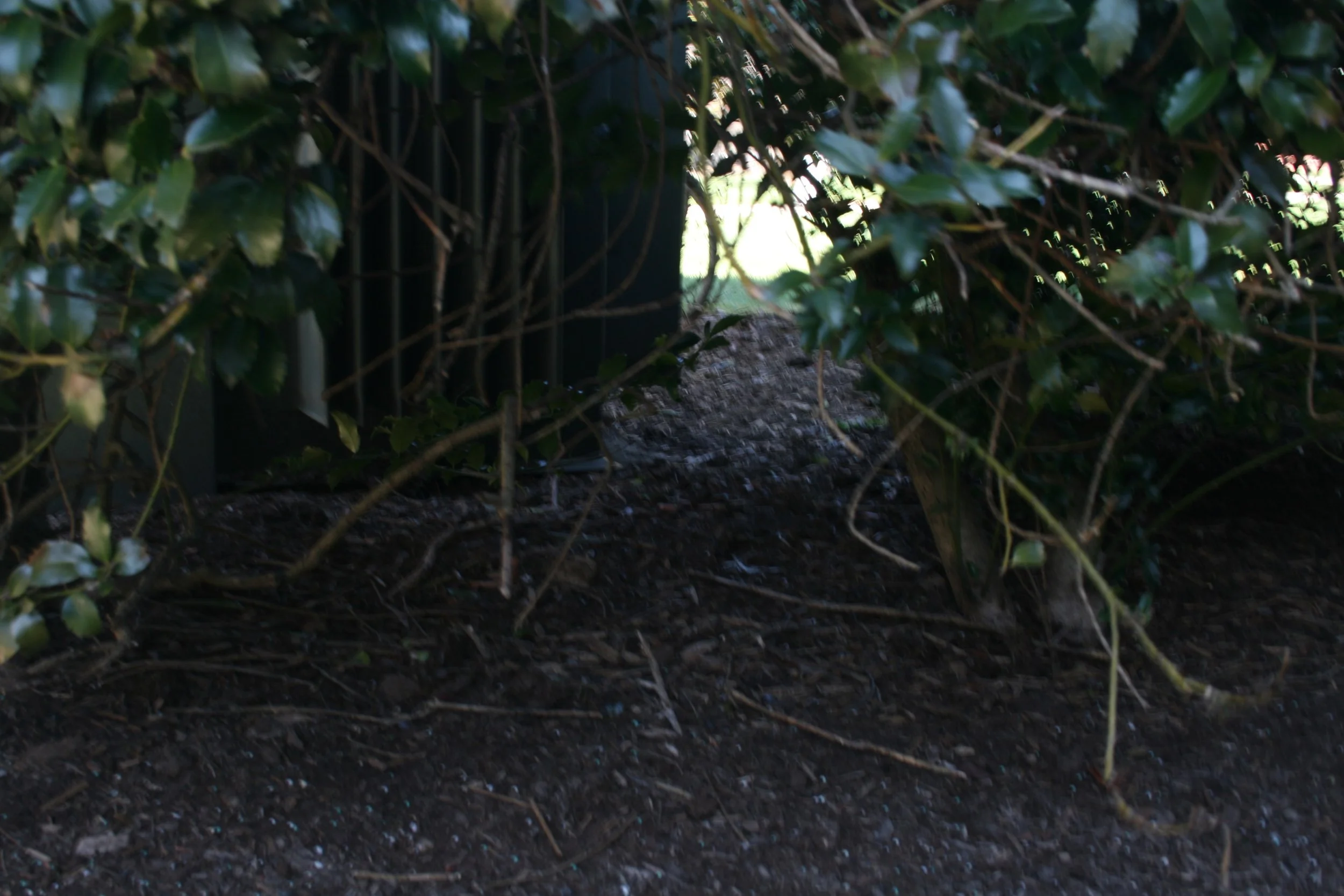
Prototyping & Iteration
Each of these five images is the result of at least three distinct shooting sessions. The first established what was possible. The second revealed what was wrong. The third delivered what I needed.
The light trail image started overexposed — the aperture was too wide and the shutter too long, producing blown-out streaks with no internal detail. Stopping down and shortening the exposure brought the trails into range. The final location was chosen specifically because the road's curve gave the trails organic movement.
The stone letters went through multiple size iterations. Early arrangements were too large — the stones spread too far apart and read as scattered rather than intentional. Tightening the spacing and reducing the letter size made them cohere into actual letterforms.
The self-portrait initially put me too far from the mirror, making me appear small in the frame. Moving closer and raising the camera to face level made the lens the dominant element of the composition.
The dorm room angle went through several adjustments. Pointing too far down compressed the perspective uncomfortably. Tilting slightly toward the horizon produced the depth that makes the room feel lived-in.
The pizza was the most technically demanding iteration — macro focus at close range is extremely sensitive, and I shot a series at slightly varying distances before landing on the sharpest frame.
FINAL DESIGNS
Here are the final five photography shots I took:
Stone Initals
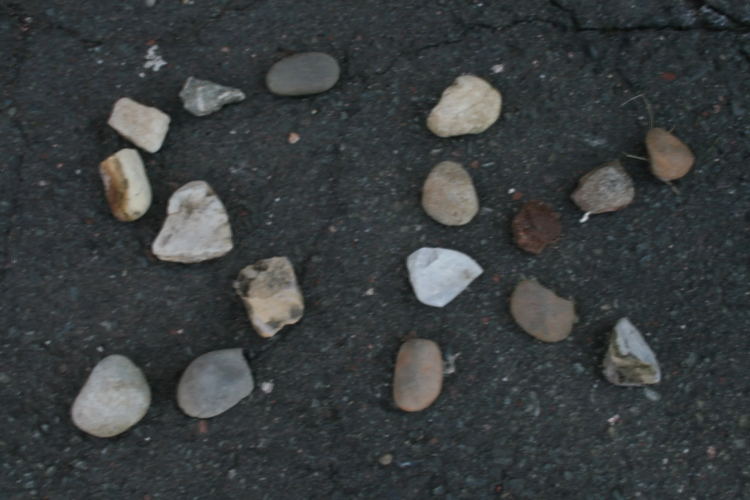
An overhead picture of my initials written using about twenty rocks that vary in both size and color (smooth grey stones, white quartz rocks, and darker rocks stained with rust). The rock on the left is more compact than the one on the right, which has lighter coloration and more space between rocks. The pavement not only serves as a contrasting surface but also adds detail to the composition.
Key Design Features:
An overhead shot keeps the stones flat against the surface, creating a greater clarity for the typography.
The dark, cracked asphalt provides a contrasting background, keeping the pale stones clear against the ground.
Differences in shape, color, and texture of the stones inside the letters create interest, yet the whole remains readable.
The roughness and uneven edges of the materials are not seen as faults to fix, but rather as part of the message being communicated.
Mirror Self-Portrait
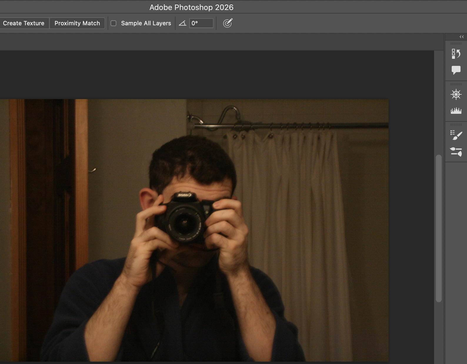
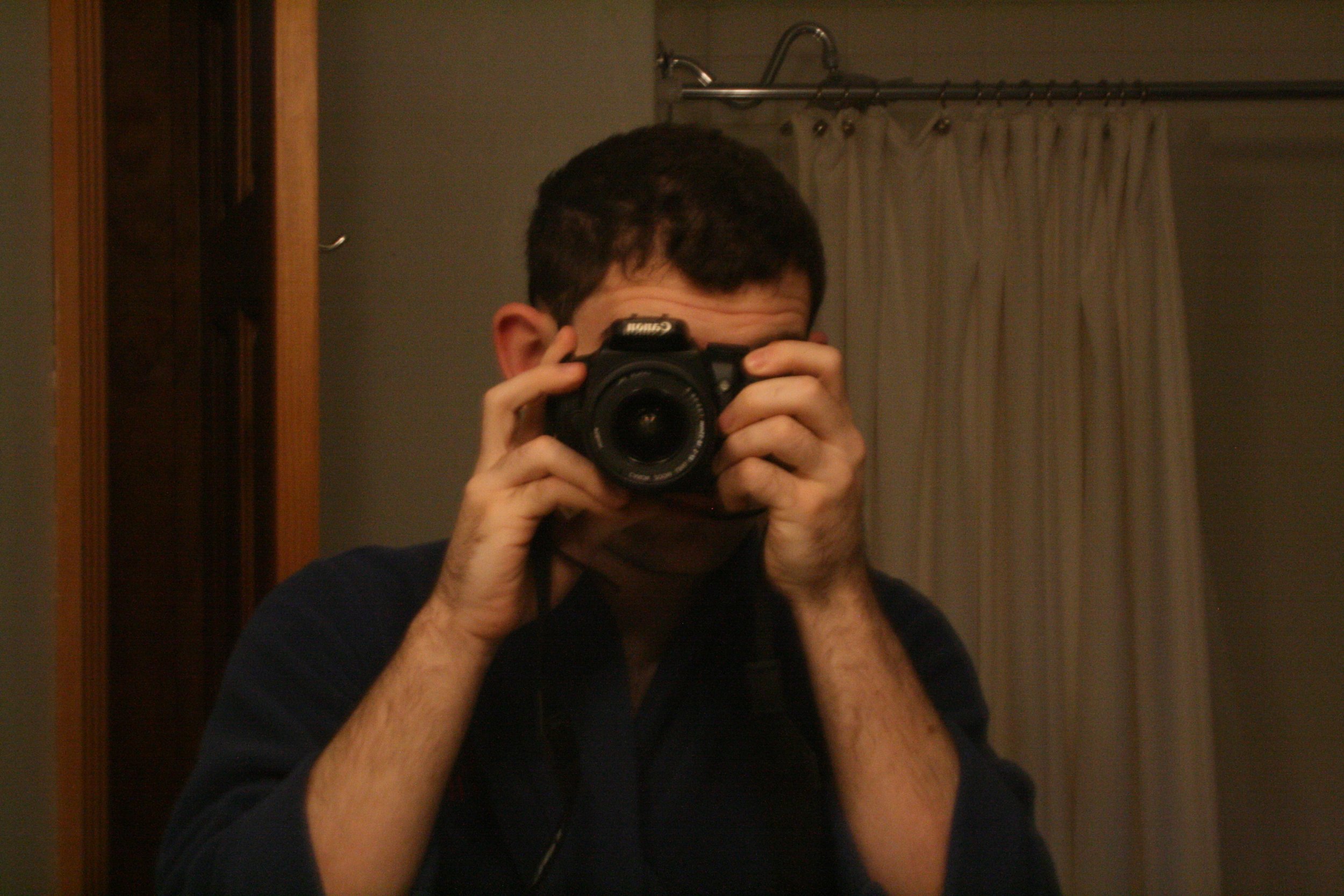
Reflection of myself with a Canon DSLR in front of the bathroom mirror, where the body of the camera obscures my face below the nose level. My head, ears, and black hair show above the viewfinder. Behind the mirror, there is a blue dress, a white shower curtain, a grey wall, and a brown door frame. The color scheme is subdued and homely. The fact that the lens is turned out makes it an engaging confrontation between the photograph and its viewer.
Key Design Features:
The camera positioned at face height crops the bottom part of the face, thereby producing a portrait that is there but unfinished by design.
— There is the addition of a symbolic element due to the use of the mirror, whereby the picture becomes a self-portrait as well as a record of making a self-portrait.
— The camera lens looking straight ahead establishes a dynamic interaction between the photograph and the viewer, engaging them in the process of photographing.
— Natural lighting and a simple home setting characterized by a gray wall, wooden door frame, and white curtain anchor the photograph in a mundane reality.
Dorm POV Shot
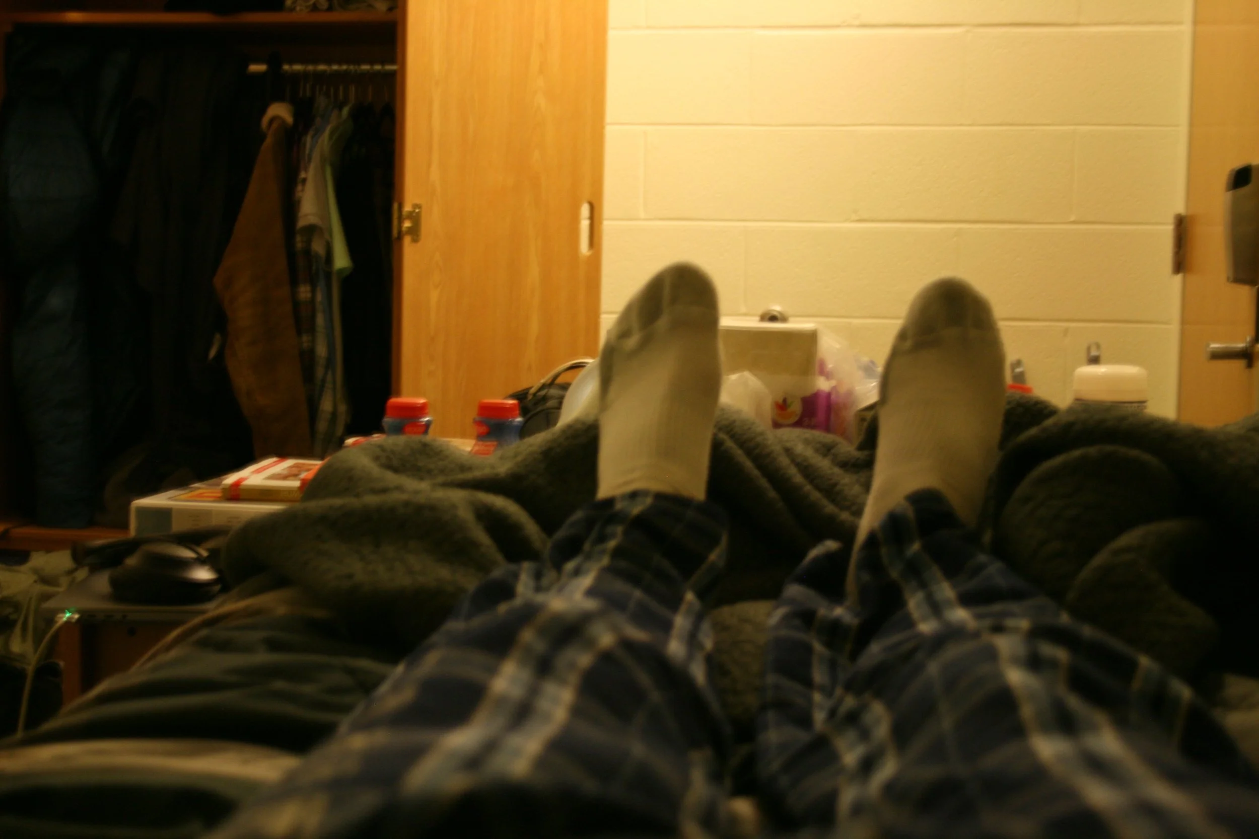
The shot is taken from a reclining angle, with a downward view of my legs spread wide in flannel plaid and a dark-colored blanket, with white socks leading towards the middle of the picture. There’s an open wardrobe in the background, with a concrete block wall, milk bottles, and my headphones on the desk.
Key Design Features:
The first-person point of view places the viewer right into the action, creating an instant connection and connotation.
— None of the environment elements have been altered or taken out – everything is there, including the chaos, the exposed closet, and the things lying on the desk because it is precisely that which is meant to be captured.
— Using a large aperture, the surroundings are blurred slightly to add depth without losing the essence of the setting.
— The color temperature is retained during post-processing, maintaining the true color of the environment instead of adjusting it to neutral tones.
Pizza CLoSe-UP
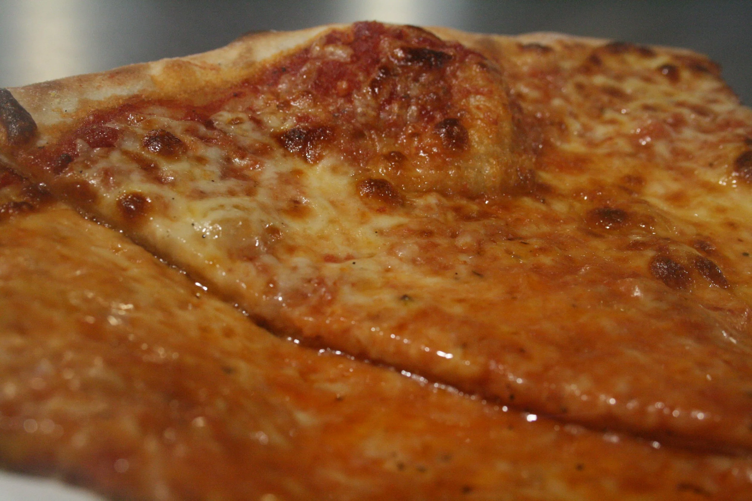
Low angle shot of two pieces of cheese pizza. The first piece occupies the bottom half of the image and the upper left edge of the frame. This piece’s surface consists of an array of colors — from red to orange to white to brown — made up of melted mozzarella, caramelized tomatoes, and oil. The second piece occupies the top half of the picture, but out of focus.
Key Design Features:
The shooting is done from a very low oblique angle, where the crust becomes the horizon line, allowing the viewer to see the flat surface as a landscape.
— Due to the shallow depth of field, the foreground is in sharp focus, whereas the background strip of the pizza melts away into a warm blur.
— When the camera is shot at minimum focusing distance, the recognizable object becomes abstract, where the pizza becomes more like a landform rather than food.
— Colors recorded in available light are so vibrant and varied that they give the picture a painterly look, which did not require much color correction.
Light Of Cars At Night
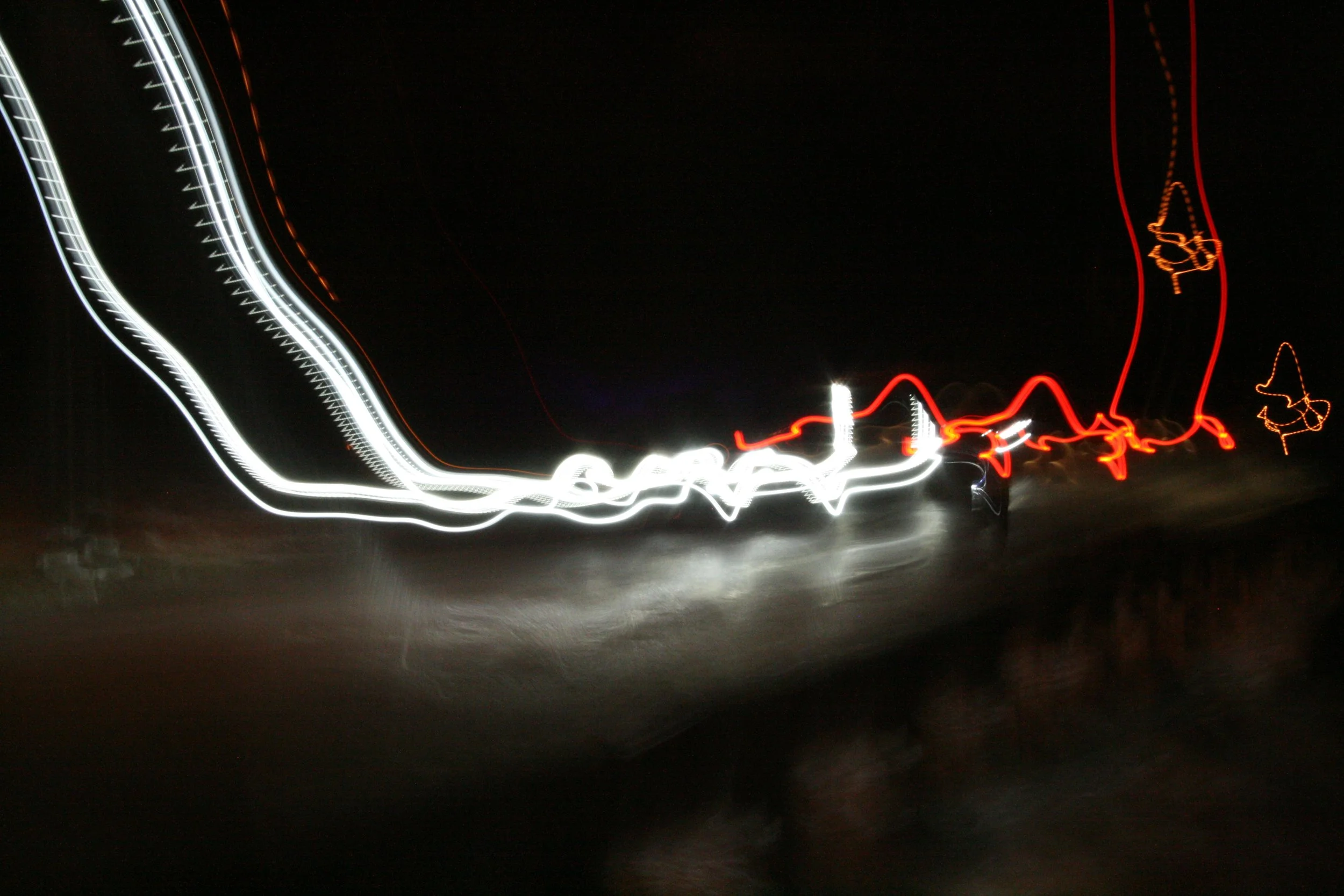
The trails of white and red lights create arcs of motion against the absolutely dark background, where the lines converge in the middle like calligraphy being drawn. The main lines of white lights move diagonally toward the center of the frame, starting from the top left, merging into a single concentrated bright spot. The red tail lights cross each other in the middle.
Key Design Features:
The long exposure time was employed to make the motion of vehicles into a series of fluid overlaps of graphics instead of stationary forms.
— Light acts as subject matter as well as the medium because the trails are both what is represented in the picture as well as what results from the photographic procedure.
— The curve of the road brings natural motion to the work as the trails do not become rigid and parallel lines in that regard.
— High contrast between the light trails and total darkness of the sky constitutes the only organizing principle in the artwork.
Impact & Reflection
Project Outcomes
What impacted me the most was the transformation of my understanding of the connection between the subject matter and imagery. Dormitory room, walkway, dinner plate – these are not fancy subject matters at all. Still, they resulted in pictures that made me proud of their quality. The picture does not result from an interesting subject matter; it comes from an interested eye.
Creating the light trails image gave me a new perspective on time as an element of design. Long exposure does not capture a single moment but compiles many moments into one. This concept, which cannot be expressed through any other medium, broadened my understanding of motion and sequence within different design fields.
The stone typography assignment confirmed a theory that I have always believed to be true but that has become more meaningful to me: materials carry their own message. The unevenness of surfaces, non-uniformity of spacing, or inaccuracy of shapes were not imperfections to be corrected. These features carried their message that a computer-based version of the same letterforms could never convey.
Learning & Growth
In regard to the basic settings such as shutter speed, aperture, and ISO, my experience prior to this project was purely theoretical; however, after several shooting exercises, I managed to turn my knowledge into intuition that helps understand what the camera needs to set to shoot a scene without thinking about it.
I have never done macro photography and found this technique quite difficult. Patience and precision were skills I lacked until the end of this project. This type of shooting is applicable for product photography, especially when it comes to showing close-up views.
This project also expanded my understanding of the subject. Before, I thought that the subject had always been a tangible object. However, during this project, I have realized that the subject could be a phenomenon (light), relation (mirror), perspective (first-person view), or texture of materials (stone versus asphalt).

Future Development
The light trail photo sets me on the path to explore even more night photography, in particular light painting — a genre in which one draws with a hand-held light source during extended exposure. This would be quite natural to take from this image.
I can imagine a number of variations on alphabets made from objects, which the stone typography hints at: leaves, shadows, water, or ice may be the basis for further experimentation within the field of typography.
The macro photograph may serve as a foundation for an entire series of images featuring the surfaces of everyday foods as abstract landscapes.
A series of photographs taken in the same manner as those in my dormitory room may form the basis of an entire project documenting my everyday life in visual art.
And finally, my mirror self-portrait can only be the start of a new series of works that involve experiments in altering the mirror itself, the setting, and the level of concealment.
Retrospective
Reflecting objectively on this project, the key strengths of this piece come down to its purposeful image creation. Every one of these images was carefully thought out before the shutter button was clicked. While many photographers with decades of experience fail to reach such a level of deliberation in their work, approaching it this way from day one has provided a valuable starting point.
By far, the greatest weakness is the inability to control lighting during the shooting process. Since all the photos were shot in natural light without additional lighting, my control over this element was somewhat limited. In future projects, using a reflector or LED panel could offer better control over lighting in portraits, dorm room shots, and food photographs.
This project proved that impressive photographs can be captured with basic equipment and minimal technical skill in everyday situations. This effort also highlighted which areas require further improvement in photography skills.