Color/Physical Studies
Overview
This section is an account of various practical graphic design assignments that were undertaken within a studio practice framework. Apart from conceptual skills and visual communications strategy formulation, each project also involved hands-on physical and digital manipulation, including illustration, typography, packaging design, magazine redesign, and historical color extraction. There were three main projects discussed in this section: a politically motivated poster, based on a quote by Mark Twain; packaging design for a fictitious brand of wine, called Devil’s Heart Red Wine; and a color-extraction project based on a medieval painting of the 15th century, using the techniques of paper collaging and handmade paints.
Role: Graphic Designer | Timespan: College Years | Platforms Used: Various
THE Problem
The field of graphic design is hardly ever isolated – it is always part of the conversation among the cultural, historical, and human experiences it engages with. For all three projects, the question was to create designs that not only looked good but also carried conceptual weight and were intentional. This necessitated more than simply appealing to aesthetics; it required delving deeper into the questions of message, audiences, and visuals. Furthermore, each project required skills in different modes of production: from digital design and layout to packaging design to collage and deconstruction.
Problem Statement
What is the role of graphic design in delivering a critical message, forming identities, and translating history visually—and how do tangible, mixed media techniques enhance design thinking and its ultimate realization?


THE CHALLENGE
Each project brought unique challenges:
Political Poster: The challenge was to express an intelligent, subtle criticism of the political system in the United States and its peculiarities – its dysfunction, corruptness, and cyclicity – without making any party affiliation or being too provocative. In addition, the poster should be eye-catching, clearly legible, and contain enough intellectual content while relying on a literary foundation, such as Mark Twain's quote: "Politicians and diapers must be changed often, and for the same reason."
Devil's Heart Wine Packaging: The difficulty was to develop a coherent brand identity for a hypothetical wine company with an interesting name. It required a certain contrast between a dark, intense visual language and elegant graphics and legibility expected of wine products. In addition, all necessary data should be included in the packaging design: bottle volume, alcohol concentration, sulfur warnings, bottling information, and year of origin.
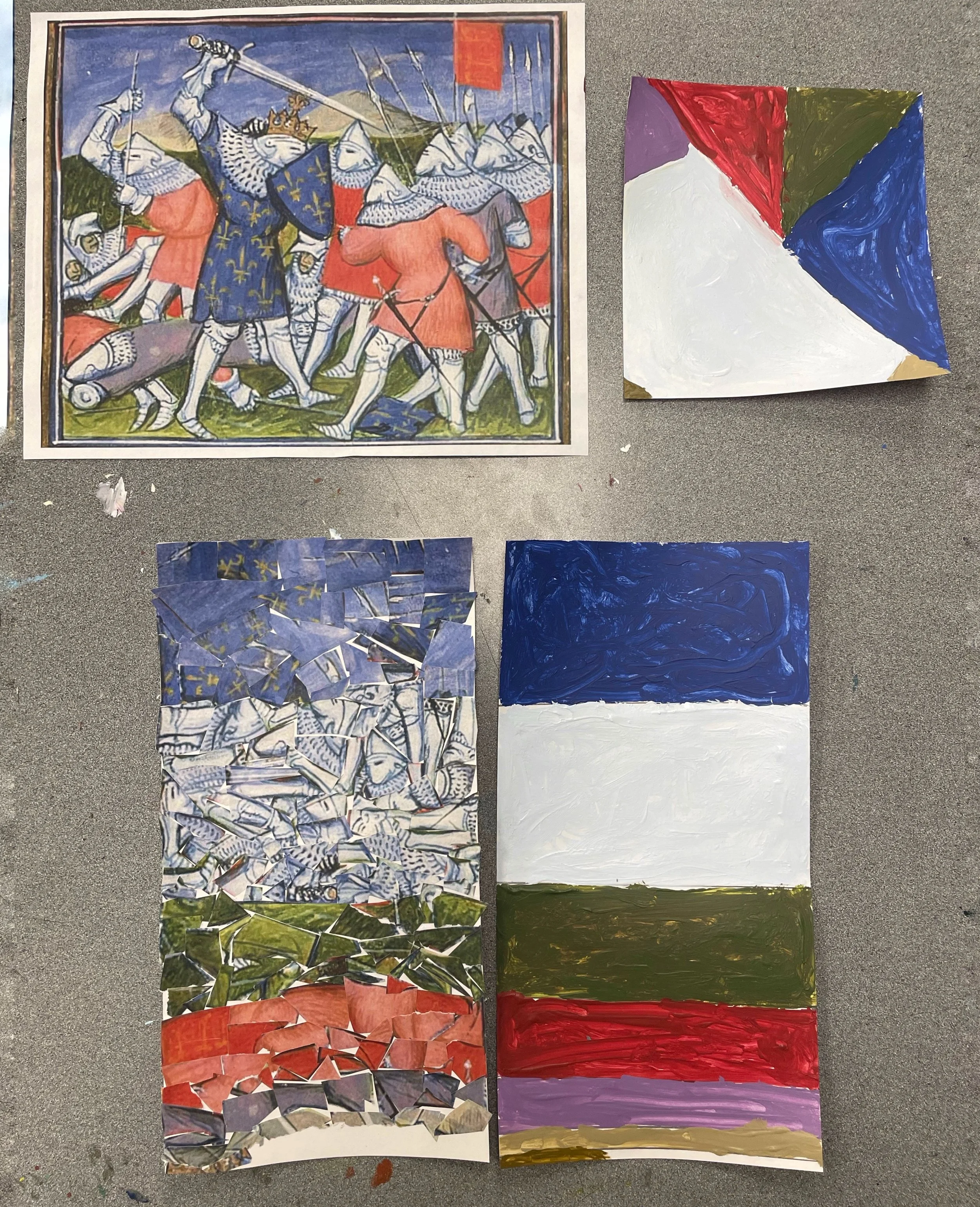
Color Extraction Study: The problem was to extract colors from a painting created over six hundred years ago and represent them using modern graphic tools and techniques. First, it required careful visual analysis and subsequent experimental work by assessing the proportionality of the colors using paper cutouts and then mixing paints.
THE PROCESS
USER RESEARCH
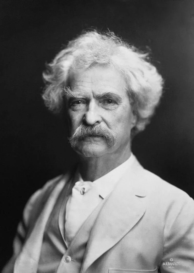
Political Poster: Research for this project began with a close reading of the Twain quote and an exploration of its contemporary relevance. The American political landscape — characterized by bipartisanship, media misinformation, and cyclical scandal — provided ample source material. The target audience was a general civic-minded public, particularly those who feel disillusioned by the two-party system, regardless of personal political affiliation. Research into political satire as a design tradition informed the visual language chosen: bold typography, symbolic imagery, and a caricature-driven approach that draws on the long history of editorial cartooning.
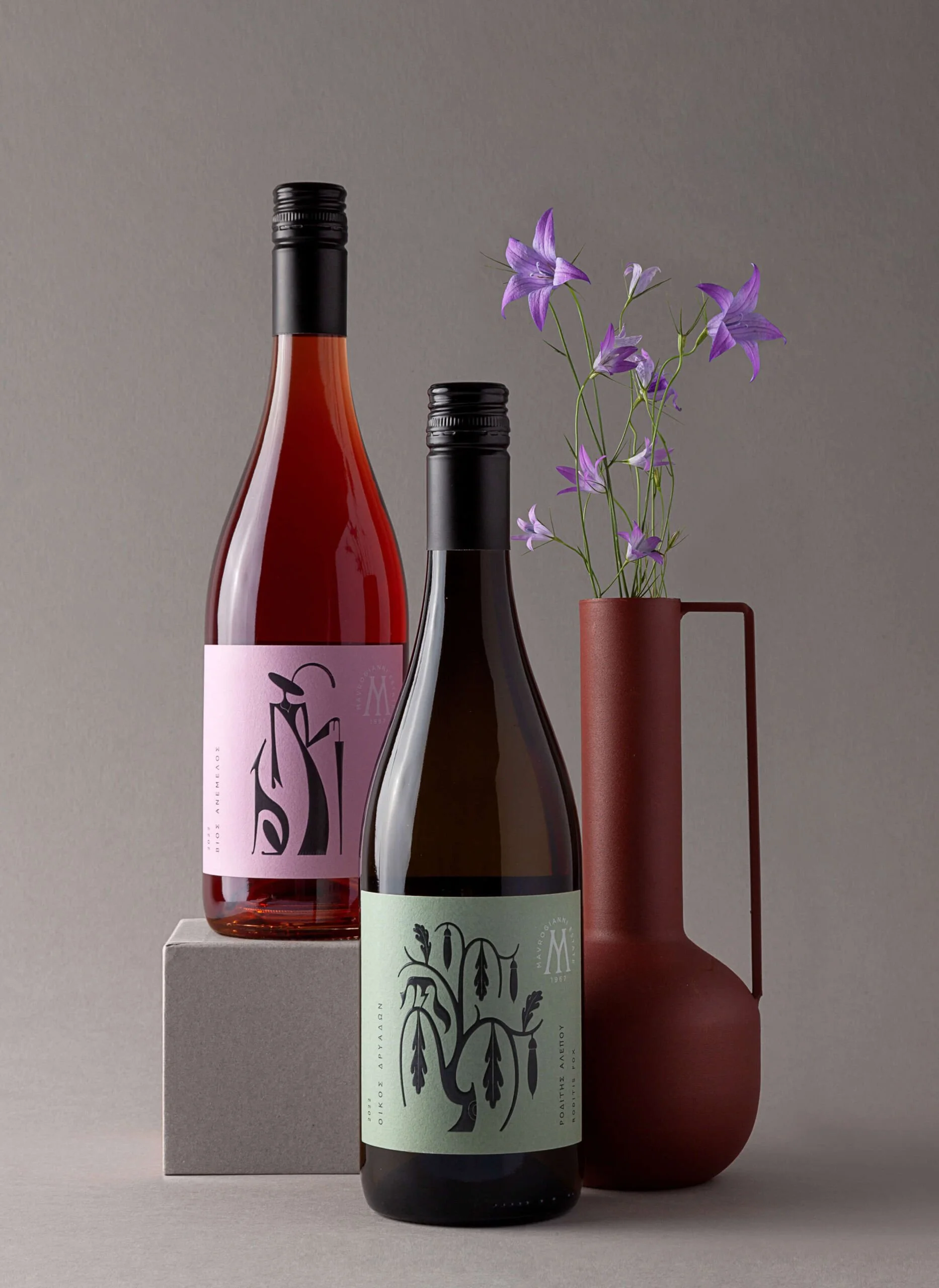
Wine Packaging: Research involved surveying the existing wine market to understand conventions of label design — how established brands use typography, illustration, color, and layout to communicate quality, personality, and genre. The target consumer for Devil's Heart was identified as a younger adult buyer drawn to bold, character-driven branding — someone who selects wine as an expression of personal aesthetics as much as taste. This informed the decision to lean into a theatrical, dark visual identity rather than a conventional, restrained label design.
Color Extraction Study: Research for this project was primarily art-historical. The source image — a medieval illuminated manuscript painting from approximately 1410 — was analyzed for its dominant color relationships, the proportional weight of each hue, and the use of flat, unmodulated color to convey spatial and narrative information. Understanding the context of medieval manuscript painting — its stylized figures, bold outlines, and symbolic use of color — helped clarify which aspects of the palette were most significant to preserve in translation.

Competitive Analysis & Inspiration
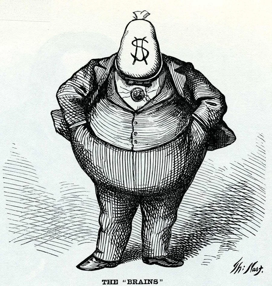
Political Poster: Influential references included the tradition of American political cartoons (particularly the work of Thomas Nast), Soviet-era propaganda poster design, and contemporary protest graphics. These precedents informed the use of bold, high-contrast color, oversized declarative typography, and symbolic visual metaphor. The diaper — a deliberately absurdist and humorous symbol drawn directly from the Twain quote — served as the central visual anchor, printed with the Republican elephant and Democratic donkey logos to make the critique explicit without being one-sided.
Wine Packaging: Competitive analysis focused on labels in the "bold personality" segment of the wine market — brands that use strong illustration, dark color palettes, and character-based branding to differentiate themselves on the shelf. The Devil's Heart concept drew inspiration from gothic illustration traditions, vintage horror aesthetics, and the visual language of craft spirits packaging. The devil heart motif — a heart shape given horns and a tail — was conceived as a distinctive, ownable brand mark that could function across multiple touchpoints.
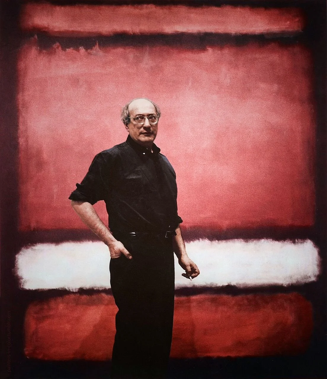
Color Extraction Study: The primary inspiration was the paintings of Mark Rothko and the broader tradition of Color Field painting, which demonstrated that a reduced palette of carefully proportioned color blocks could carry enormous emotional and visual weight. The medieval source image offered a rich, non-naturalistic palette — deep cobalt blues, saturated reds, muted greens, purples, and gold — that, when isolated from their figurative context, functioned as an abstract color composition in its own right.
VISUAL DESIGN STRATEGY
Political Poster:
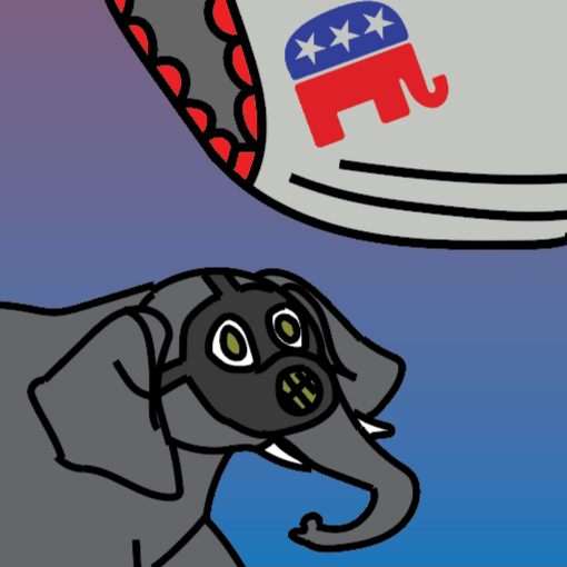
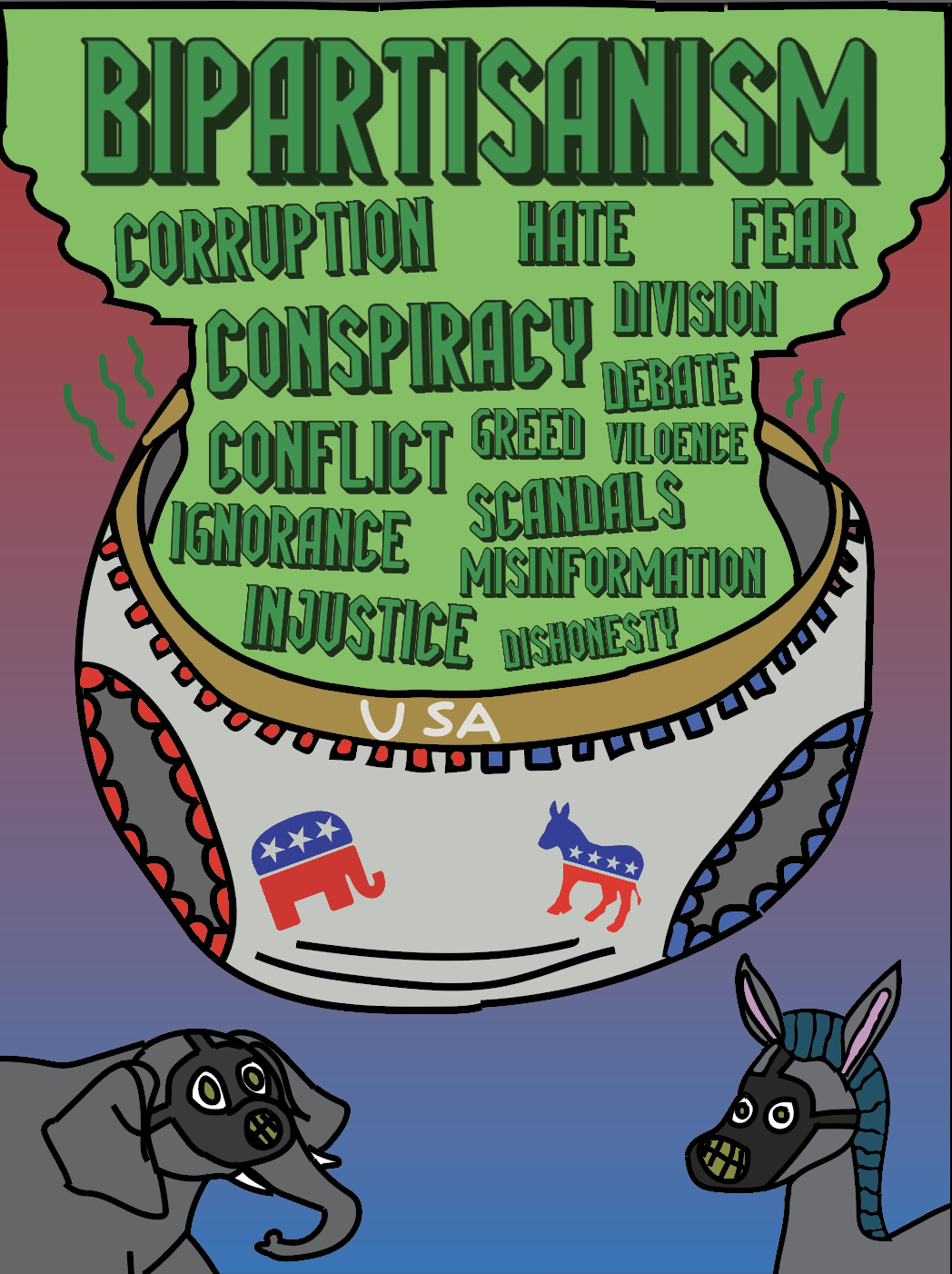
The visual approach revolved around the metaphor created by the Twain quote. A huge diaper, marked with "USA" and adorned with images of the Republican and Democratic party logos, forms the focal point of the poster design, spilling out into a mass of poisonous green vapor. Above it, the dominant word "BIPARTISANISM" appears at the top of the poster layout, while an avalanche of politically charged keywords, including "Corruption," "Conspiracy," "Greed," "Misinformation," "Injustice," "Division," "Dishonesty," and many more, fills the remaining area. Caricatures of the Republican elephant and Democratic donkey are shown looking upwards at the diaper, wearing gas masks. The color scheme ranges from red to purple to blue, with the latter transitioning into a sickly acid-green for the toxic vapor cloud, symbolizing the binary dichotomy of the two-party system and highlighting the equal role played by both parties in perpetuating the issue.
Color Extraction Study:
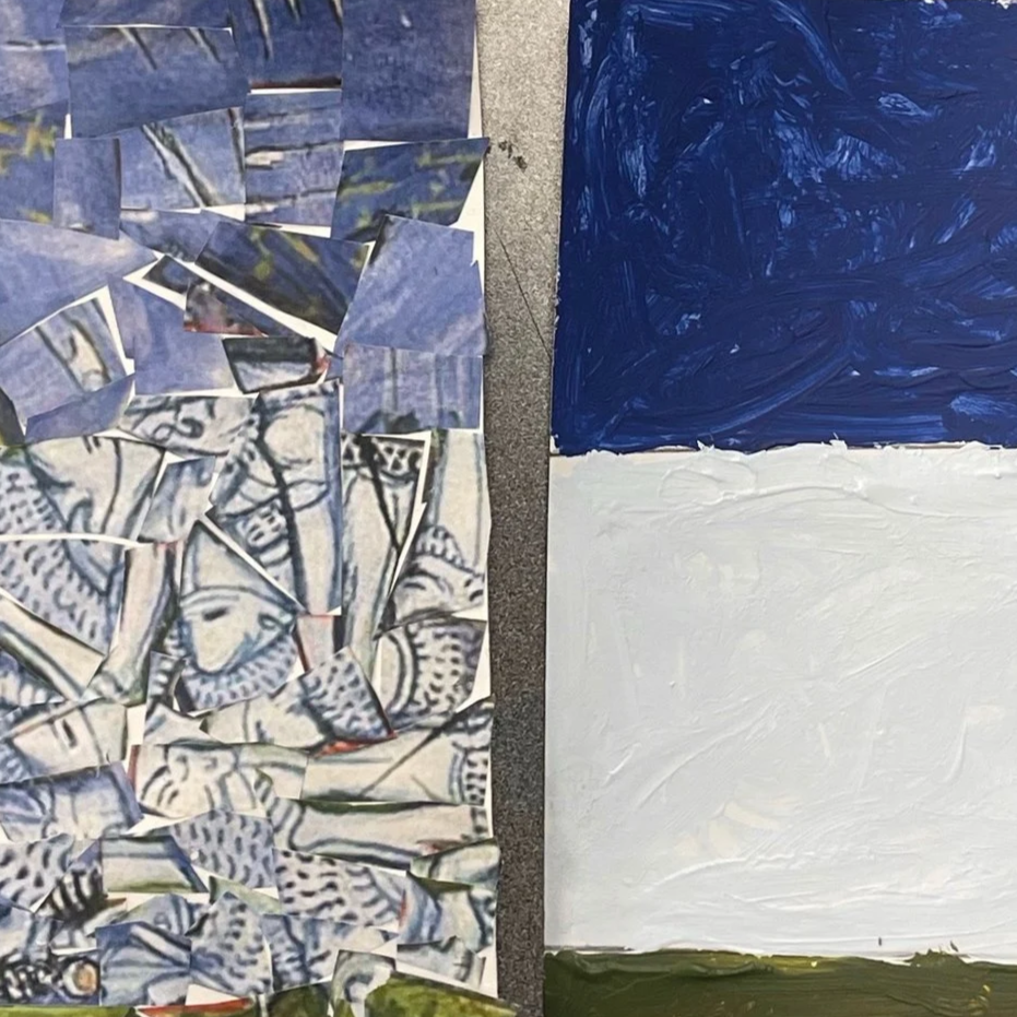
The visual method consisted of a dual translation process. The first step entailed cutting the source image, which was a battle scene from medieval times, into pieces before assembling it as a collage with the color content remaining the same but taking on an abstract form. In essence, this step was akin to an inventory exercise since one could assess the relative proportions of each area in terms of colors by cutting and piecing the parts of the image. From there, the collage would be the basis for the second phase of painting simple color blocks with acrylic paint, using the colors drawn from the source piece as inspiration. The resulting designs narrowed the range of colors used in the painting to five key bands of colors, namely cobalt blue, white, olive green, red, and purple, presented as flat Rothko-inspired color blocks.
Wine Packaging:
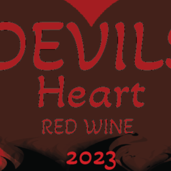
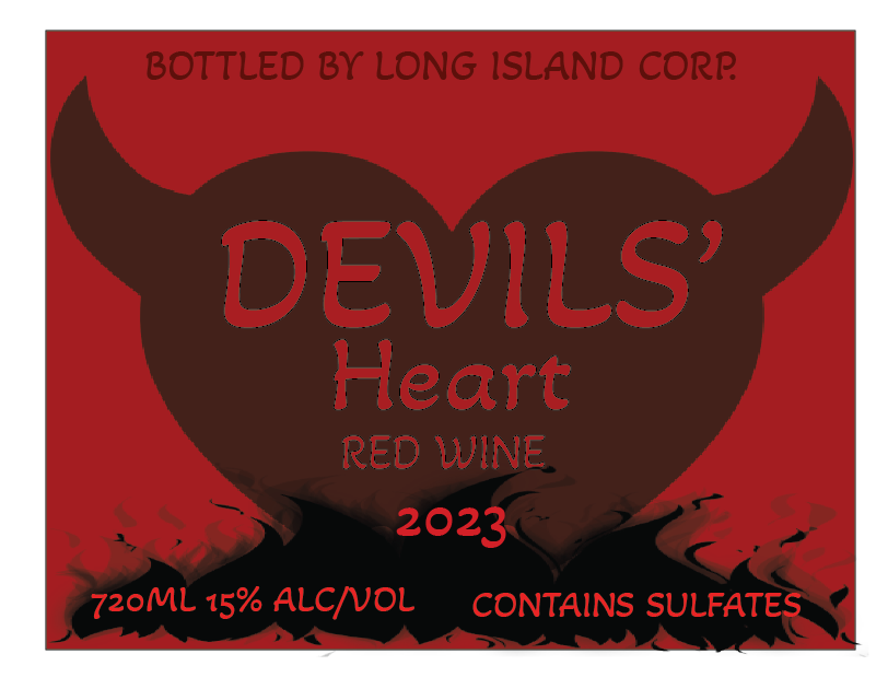
The label design for Devil's Heart Red Wine utilizes the dark red color scheme, focusing on a large silhouette of a heart with devil horns placed in the middle. It is designed in a deep brownish-black color making the design mysterious and enigmatic. For "DEVILS' Heart," a mixed typography technique is used: "DEVILS'" is created in bold condensed san-serif letters to make them look strong, while "Heart" appears in cursive fonts to add a romantic vibe to the brand name. The brand name is followed by the phrase "RED WINE" in capitalized all-sans serif letters, after which the year of production "2023" follows. Underneath the brand, the design features the gothic elements such as flames and smoke rising from the base of the label design. All legal text is located at the bottom part of the bottle: it includes information about the bottler (Long Island Corp.), volume of wine (720mL), and alcohol content (15% ALC/VOL). The sulfate warning is also added here.
Prototyping & Iteration
Political Poster: The design was developed through multiple compositional sketches exploring different ways to visualize the Twain quote. Early iterations experimented with more literal representations before settling on the diaper metaphor as the most effective vehicle for both humor and critique. Typography was hand-lettered and refined through multiple passes, with attention paid to the relative scale and placement of each term in the word cloud to ensure visual coherence and readable hierarchy.
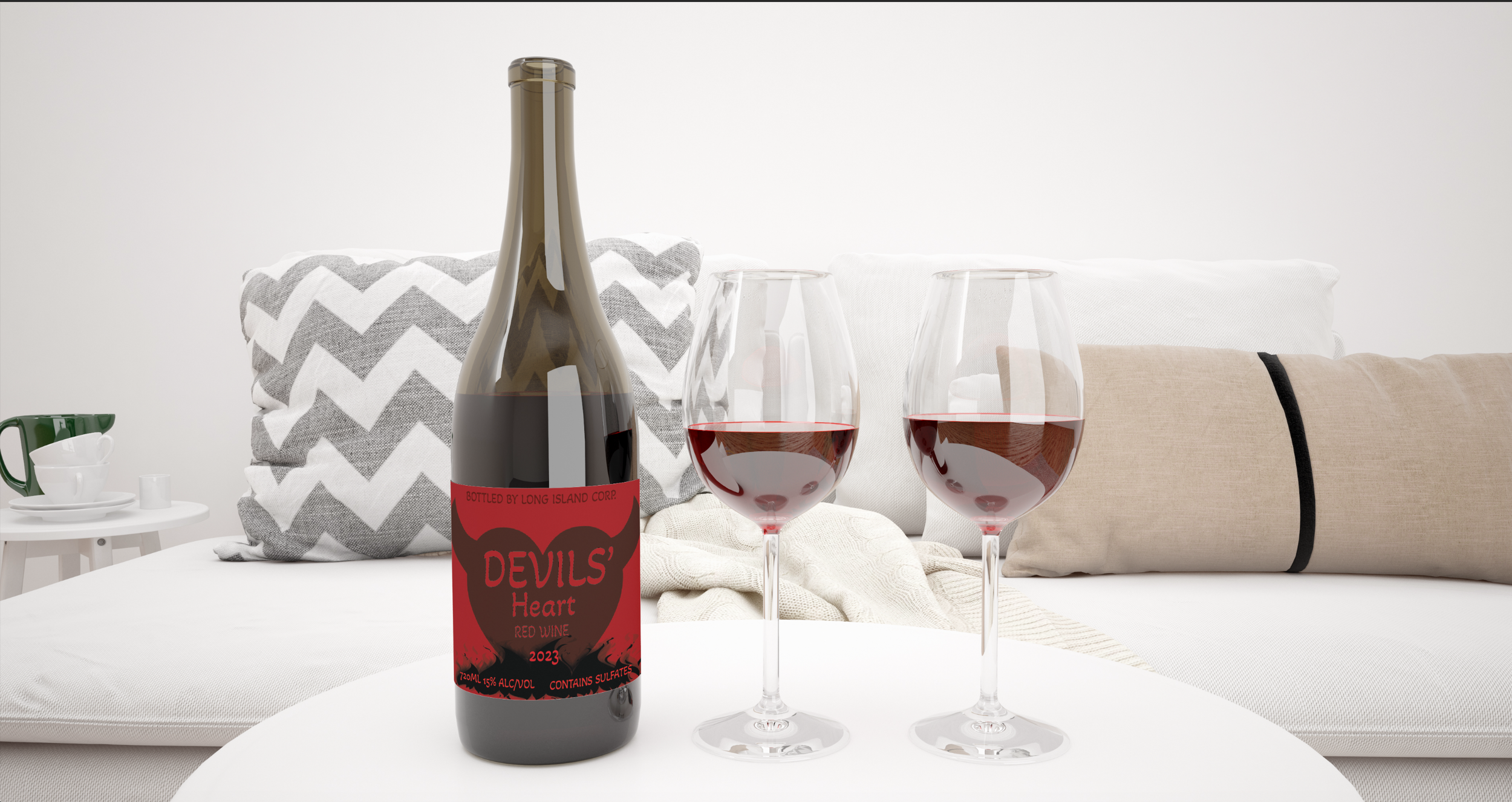
Wine Packaging: The label design underwent iterative refinement of the central devil heart motif, the typographic pairing, and the integration of regulatory text. The design was then placed into a photorealistic bottle mockup rendered in a lifestyle setting — a contemporary living room with wine glasses — to evaluate how the label reads at scale and in three-dimensional context. This mockup stage was essential for assessing whether the label's contrast and legibility held up against the bottle's dark glass.
Color Extraction Study: Prototyping in this project was primarily physical. The collage stage — cutting apart printed copies of the source image and reassembling them — served as a hands-on iterative process for understanding color proportion and distribution. Multiple small painted studies were produced to test color mixing accuracy and compositional arrangements before committing to the final simplified designs. The process of hand-mixing paint to match historical pigments introduced productive constraints: colors that appeared straightforward in the source image proved nuanced and complex to reproduce, deepening the understanding of the original painter's palette.
FINAL DESIGNS
PolItical Poster
A full-bleed, editorial-style poster advertisement featuring an image of a diaper overflowing with political jargon, with the Republican and Democratic party mascots in gas masks on each side.
Key Design Features:
In terms of graphic design, the most important aspect of the poster is its use of a unified central metaphor – the diaper – to organize all other visual elements in the composition. The hand-drawn typography varies in weight and size throughout the word cloud to emphasize the chaos associated with the subject matter depicted. In addition, the gradient in the poster's background color symbolizes a balance between the two opposing parties, while acid green, the color of the toxic cloud, serves as a neutral third color not connected to either. The gas mask of an elephant and a donkey, used as an image at the bottom of the composition, adds a touch of dark humor while keeping all elements grounded. It should be noted that neither of the two parties appears more responsible than the other – both appear equally involved in the mess spilling out of the diaper.
Devil’s Heart Red Wine Packaging
A full wine label design including the devil heart logo, typography design, flame elements, and all relevant information for legal purposes, placed on a realistic image of a bottle.
Key Design Features:
The key element of this label design is the use of ambiguous figure-ground: the image of the devil's heart is drawn in dark brown-black, which contrasts so slightly with the red background that it takes time to see and appreciate the mark. The combination of the fonts used here is an intentional effort to achieve tonal contrast between aggression ("Devils'") and romance ("Heart"). It is interesting how the gothic flames dripping up from the bottom edge convey a sense of movement and continue the theme while remaining non-intrusive. Finally, the fact that all necessary information, including bottler, volume, alcohol content, sulfates, and year, is well incorporated into the label design shows that the designer has taken the practical aspects of product packaging design into consideration. The lifestyle mock-up, showing the bottle alongside the wine glasses on a coffee table, confirmed that this particular label works in real-life conditions.
Color Extraction Study
A group of paintings that document the entire translation process, including: the original medieval painting image; a cut-out collage piece that separates and distributes color; a small corner study in paint; and the final color-block painting in acrylics.
Key Design Features:
The key to this design process is that the process itself becomes the product. This is demonstrated through a triptych presentation of three stages of the work, including the original source image, a paper collage, and a final painted abstraction. Specifically, the paper collage is of special importance since the physical act of cutting up the source painting into parts and reconstructing it in some manner allowed for the proportions of each color region to be measured. The final abstractions created through this process are executed as large, flat color fields divided horizontally into sections, evoking the spirit of Color Field Painting while clearly derivative of their source in 15th-century Italy. Mixing historical paints by hand to achieve the desired hues added an element of productive ambiguity since a hue mixed in such a manner cannot help but have a warmth and nuance that can never be replicated digitally.
Impact & Reflection
Project Outcomes
All three projects met their respective design goals. The political poster effectively conveys its bipartisan message without taking a specific political stance. Through visual irony and graphic overload, the poster reflects the current state of politics. The Devil’s Heart label creates an aesthetically pleasing brand identity that fulfills all the demands for effective packaging design. Finally, the color extraction exercise resulted in an artistic record and a collection of painted artworks that can be considered on their own terms, despite being tied to their historical origins.
Learning & Growth
These projects also helped build many fundamental aspects of design proficiency. Moving between the digital realm and the physical world helped reinforce the notion that design theory is not bound to a medium, but applies equally to working in programs like Illustrator as well as with paper and paint. Specifically, the packaging design project taught us how to design for a 3-dimensional object and how to test a design in the real world by creating a mock-up. The color extraction assignment required intense focus on proportions, hues, and values that translated into improved observational skills that benefit every aspect of design. Finally, the political poster project tested our ability to create an impactful design without being too overt about the topic portrayed, which is an essential skill for every designer.

Future Development
There are several possible ways forward for future iterations of these projects. First, the idea of political posters could be explored in a series of pieces, each one targeting a unique problem area, such as media, financing, or foreign relations, using the same aesthetic but applying a different metaphor. Second, the Devil’s Heart wine brand could become an identity, including new labels for other wine varietals, as well as digital branding tools. Third, the process of extracting colors from historical paintings could be applied to art from other periods, including the Renaissance, Baroque, and Impressionism, to create a comparative piece that shows how each period could be reinterpreted visually in a new style. Fourth, physical mixed media could become a bigger component of the digital process, integrating some of its immediacy into the design.
Retrospective
Upon reflection on all three projects, what comes through is the importance of constraining oneself as a means of unleashing creativity. In all three cases, the breakthroughs occurred not by imposing restrictions on oneself, but by working within some sort of limitation – either the verbatim use of a literary citation, adherence to packaging regulations, or the use of an ancient set of colors for a painting. Rather than impeding creativity, such limitations helped channel it in a way that might otherwise never occur due to a lack of decision-making. Also, the physical act of designing – namely, cutting, arranging, and repainting a piece for the color study project – was a lesson in itself in how designing is not simply an intellectual or computer-based task, but one that involves the body. The difficulty of manipulating various media and tools – namely, the rigidity of physical materials, the imperfections of mixing paint, and the irreversible action of cutting paper – provided productive conflict that enhanced the experience.